

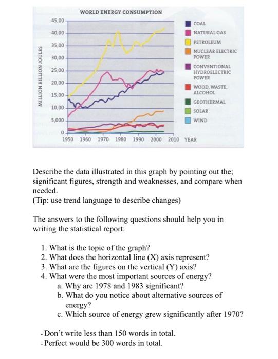
Question: Describe the data illustrated in this graph by pointing out the; significant figures, strength and weaknesses, and compare when needed. (Tip: use trend language to
Describe the data illustrated in this graph by pointing out the; significant figures, strength and weaknesses, and compare when needed.
(Tip: use trend language to describe changes)
The answers to the following questions should help you in writing the statistical report:
1. What is the topic of the graph?
2. What does the horizontal line (X) axis represent?
3. What are the figures on the vertical (Y) axis?
4. What were the most important sources of energy?
a. Why are 1978 and 1983 significant?
b. What do you notice about alternative sources of energy?
c. Which source of energy grew significantly after 1970?
- Dont write less than 150 words in total.
- Perfect would be 300 words in total.
Step by Step Solution
There are 3 Steps involved in it
1 Expert Approved Answer
Step: 1 Unlock

Question Has Been Solved by an Expert!
Get step-by-step solutions from verified subject matter experts
Step: 2 Unlock
Step: 3 Unlock