

Question: did i do 10, 12, and 14 correct? and please help on 8, 11, and 13. 8. Market equilibrium The following table shows the weekly
did i do 10, 12, and 14 correct? and please help on 8, 11, and 13.
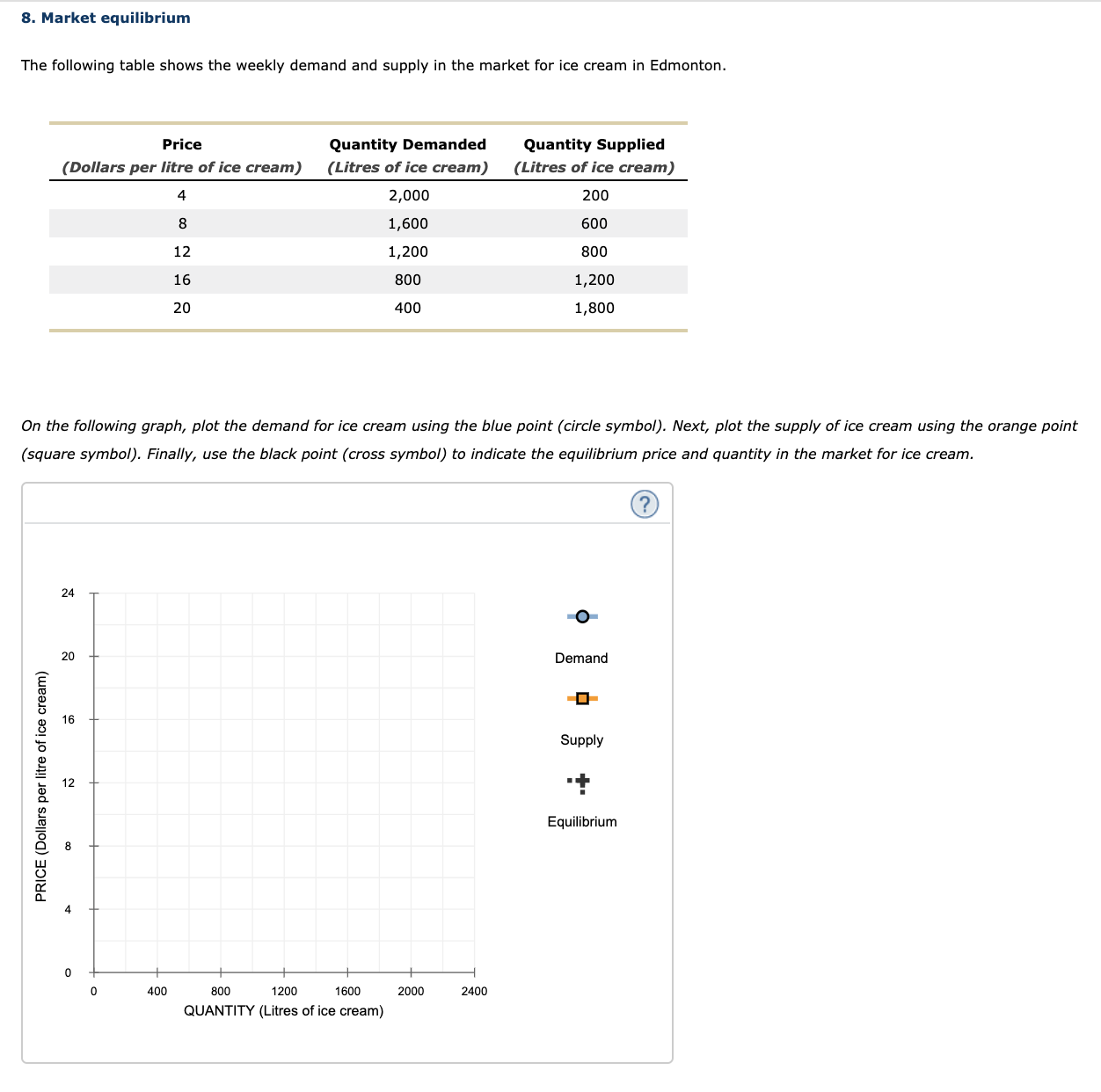

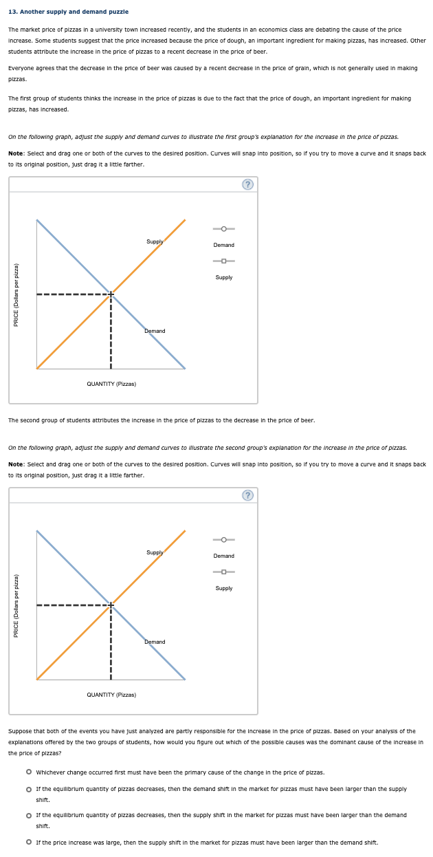
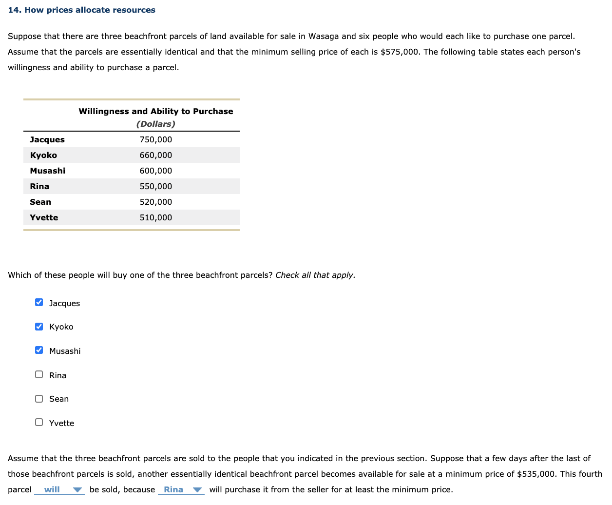
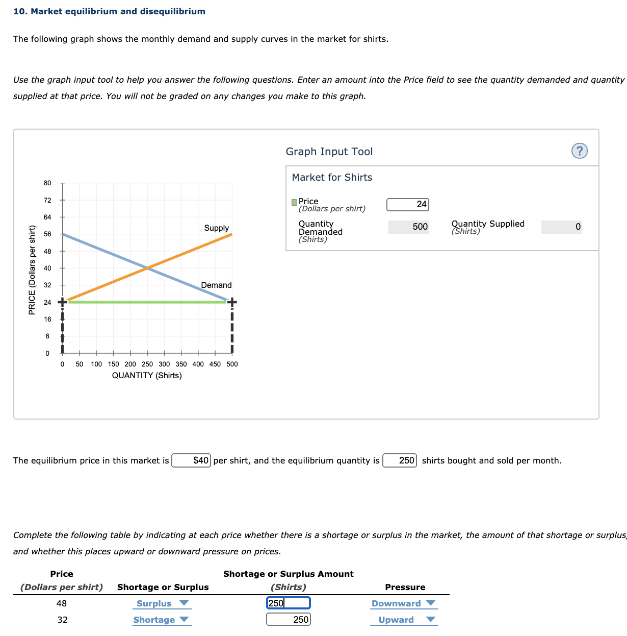
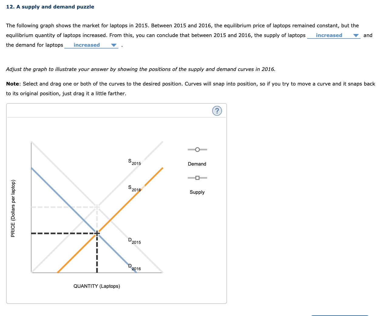
8. Market equilibrium The following table shows the weekly demand and supply in the market for ice cream in Edmonton. Price Quantity Demanded Quantity Supplied (Dollars per litre of ice cream) (Litres of ice cream) (Litres of ice cream) 4 2,000 200 8 1,600 600 12 1,200 800 16 800 1,200 20 400 1,800 On the following graph, plot the demand for ice cream using the blue point (circle symbol). Next, plot the supply of ice cream using the orange point (square symbol). Finally, use the black point (cross symbol) to indicate the equilibrium price and quantity in the market for ice cream. ? 24 O 20 PRICE (Dollars per litre of ice cream) Demand 16 Supply 2 Equilibrium 0 400 800 1200 1600 2000 2400 QUANTITY (Litres of ice cream)11. How shifts in demand and supply affect equilibrium Consider the market for pens. Suppose that a new educational study has proven that the practice of writing, erasing, and rewriting Improves students' ability to process Information, leading parents to steer away from pen use in favour of pencils. Moreover, the price of plastic, an Important Input In pen production, has increased considerably. On the following graph, labelled Scenario 1, indicate the effect these two events have on the demand for and supply of pens. Note: Select and drag one or both of the curves to the desired position. Curves will snap into position, so If you try to move a curve and it snaps back to Its original position, just drag it a little farther. Scenario 1 10 O Supply Demand PRICE (Dollars per pen) Supply Demand 9 10 QUANTITY (Millions of pens) Next, complete the following graph, labelled Scenario 2, by shifting the supply and demand curves in the same way that you did on the Scenario 1 graph. Note: Select and drag one or both of the curves to the desired position. Curves will snap Into position, so If you try to move a curve and it snaps back to Its original position, just drag it a little farther. (?) Scenario 2 10 Supply Demand PRICE (Dollars per pen) Supply Demand 9 QUANTITY (Millions of penis) Compare both the Scenario 1 and Scenario 2 graphs. Notice that after completing both graphs, you can now see a difference between them that wasn't apparent before the shifts because each graph Indicates different magnitudes for the supply and demand shifts in the market for pens. Use the results of your answers on both the Scenario I and Scenario 2 graphs to complete the following table. Begin by Indicating the overall change In the equilibrium price and quantity after the shift in demand or supply for each shift-magnitude scenario. Then, in the final column, Indicate the resulting change in the equilibrium price and quantity when supply and demand shirt in the direction you previously Indicated on both graphs. If you cannot determine the answer without knowing the magnitude of the shifts, choose Cannot determine. Change In Equilibrium Objects Equilibrium Object Scenario 1 Scenario 2 When Shift Magnitudes Are Unknown Price Quantity True or False: When both the demand and supply curves shift, the curve that shifts by the smaller magnitude determines the effect on the undetermined equilibrium object. . True 0 False13. Another supply and demand puzzle The market price of pizzas in a university town Increased recently, and the students In an economics class are debating the cause of the price Increase. Some students suggest that the price Increased because the price of dough, an Important Ingredient for making pizzas, has increased. Other students attribute the Increase in the price of pizzas to a recent decrease in the price of beer. Everyone agrees that the decrease in the price of beer was caused by a recent decrease in the price of grain, which Is not generally used In making pizzas. The first group of students thinks the Increase in the price of pizzas is due to the fact that the price of dough, an Important Ingredient for making pizzas, has Increased. On the following graph, adjust the supply and demand curves to Mustrate the first group's explanation for the increase in the price of pizzas. Note: Select and drag one or both of the curves to the desired position. Curves will snap Into position, so If you try to move a curve and it snaps back to Its original position, just drag it a little farther. (? O Supply Demand PRICE (Dollars per pizza) Supply Demand QUANTITY (Pizzas) The second group of students attributes the increase in the price of pizzas to the decrease in the price of beer. On the following graph, adjust the supply and demand curves to Mustrate the second group's explanation for the Increase in the price of pizzas. Note: Select and drag one or both of the curves to the desired position. Curves will snap into position, so If you try to move a curve and it snaps back to Its original position, just drag it a little farther. (?) Supply Demand PRICE (Dollars per pizza) Supply Demand QUANTITY (Pizzas) Suppose that both of the events you have just analyzed are partly responsible for the Increase in the price of pizzas. Based on your analysis of the explanations offered by the two groups of students, how would you figure out which of the possible causes was the dominant cause of the Increase In the price of pizzas? Whichever change occurred first must have been the primary cause of the change In the price of pizzas. O If the equilibrium quantity of pizzas decreases, then the demand shift In the market for pizzas must have been larger than the supply shift. If the equilibrium quantity of pizzas decreases, then the supply shift in the market for pizzas must have been larger than the demand shift. ) If the price increase was large, then the supply shift in the market for pizzas must have been larger than the demand shift.14. How prices allocate resources Suppose that there are three beachfront parcels of land available for sale in Wasaga and six people who would each like to purchase one parcel. Assume that the parcels are essentially identical and that the minimum selling price of each is $575,000. The following table states each person's willingness and ability to purchase a parcel. Willingness and Ability Ino Purchase (Dollars) Jacques 750,000 Kyolto 660,000 Musashi 600,000 Rina 550,000 Sean 520,000 Yvette 510,000 Which of these people will buy one of the three beachfront parcels? Check all that apply. Jacques Kyoko Musashi C] Rina C] Sean D Yvette Assume that the three beachfront parcels are sold to the people that you indicated in the previous section. Suppose that a few days after the last of those beachfront parcels is sold, another essentially identical beachfront parcel becomes available for sale at a minimum price of $535,000. This fourth parcel will V be sold, because Rina V will purchase it from the seller for at least the minimum price. 10. Market equilibrium and disequilibrium The following graph shows the monthly demand and supply curves in the market for shirts. Use the graph input tool to help you answer the following questions. Enter an amount into the Price field to see the quantity demanded and quantity supplied at that price. You will not be graded on any changes you make to this graph. Graph Input Tool (? Market for Shirts Price (Dollars per shirt) 24 PRICE (Dollars per shirt) Supply Quantity Demanded 500 Quantity Supplied (Shirts) 0 (Shirts) Demand O 50 100 150 200 250 300 350 400 450 500 QUANTITY (Shirts) The equilibrium price in this market is $40 per shirt, and the equilibrium quantity is |250 shirts bought and sold per month. Complete the following table by indicating at each price whether there is a shortage or surplus in the market, the amount of that shortage or surplus and whether this places upward or downward pressure on prices Price Shortage or Surplus Amount (Dollars per shirt) Shortage or Surplus (Shirts) Pressure Surplus 250 Downward 32 Shortage 250 Upward12. A supply and demand puzzle The following graph shows the market for laptops in 2015. Between 2015 and 2016, the equilibrium price of laptops remained constant, but the equilibrium quantity of laptops increased. From this, you can conclude that between 2015 and 2016, the supply of laptops increased and the demand for laptops increased Adjust the graph to illustrate your answer by showing the positions of the supply and demand curves in 2016. Note: Select and drag one or both of the curves to the desired position. Curves will snap into position, so if you try to move a curve and it snaps back to its original position, just drag it a little farther. O- S 2015 Demand PRICE (Dollars per laptop) S 2016 Supply D 2015 D 2016 QUANTITY (Laptops)
Step by Step Solution
There are 3 Steps involved in it

Get step-by-step solutions from verified subject matter experts