

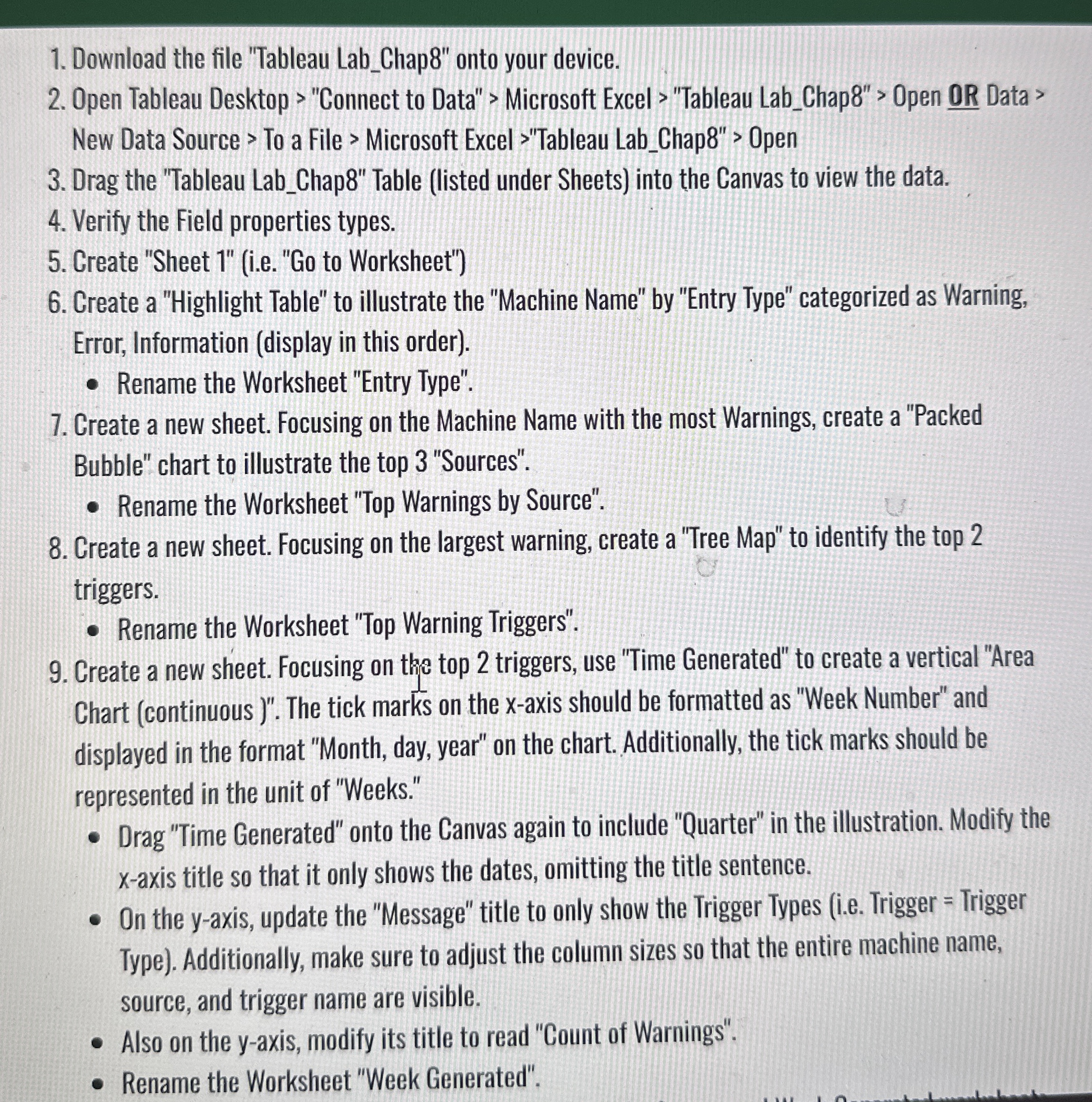
Question: Download the file Tableau Lab _ Chap 8 onto your device. Open Tableau Desktop > Connect to Data > Microsoft Excel > Tableau Lab
Download the file "Tableau LabChap onto your device.
Open Tableau Desktop "Connect to Data" Microsoft Excel "Tableau LabChap Open OR Data New Data Source To a File Microsoft Excel "Tableau LabChap Open
Drag the "Tableau LabChap Table listed under Sheets into the Canvas to view the data.
Verify the Field properties types.
Create "Sheet ieGo to Worksheet"
Create a "Highlight Table" to illustrate the "Machine Name" by "Entry Type" categorized as Warning, Error, Information display in this order
Rename the Worksheet "Entry Type".
Create a new sheet. Focusing on the Machine Name with the most Warnings, create a "Packed Bubble" chart to illustrate the top "Sources".
Rename the Worksheet "Top Warnings by Source".
Create a new sheet. Focusing on the largest warning, create a "Tree Map" to identify the top triggers.
Rename the Worksheet "Top Warning Triggers".
Create a new sheet. Focusing on the top triggers, use "Time Generated" to create a vertical "Area Chart continuous The tick marks on the x axis should be formatted as "Week Number" and displayed in the format "Month, day, year" on the chart. Additionally, the tick marks should be represented in the unit of "Weeks."
Drag "Time Generated" onto the Canvas again to include "Quarter" in the illustration. Modify the axis title so that it only shows the dates, omitting the title sentence.
On the axis, update the "Message" title to only show the Trigger Types ie Trigger Trigger Type Additionally, make sure to adjust the column sizes so that the entire machine name, source, and trigger name are visible.
Also on the yaxis, modify its title to read "Count of Warnings".
Rename the Worksheet "Week Generated".
Step by Step Solution
There are 3 Steps involved in it
1 Expert Approved Answer
Step: 1 Unlock

Question Has Been Solved by an Expert!
Get step-by-step solutions from verified subject matter experts
Step: 2 Unlock
Step: 3 Unlock