

Question: Draw a graph like Figure 12.3B. Initially the embargo is the one shown in this graph. Then, half of the nonembargoing countries switch and become
Draw a graph like Figure 12.3B. Initially the embargo is the one shown in this graph. Then, half of the nonembargoing countries switch and become part of the embargo. Use your graph to show how this changes the effects of the embargo. Specifically, what are the effects on the initial embargoing countries and on the target country? Does this shift make the embargo more or less likely to succeed? Why?
Which of the following trade policy moves is most certain to bring gains to the world as a whole
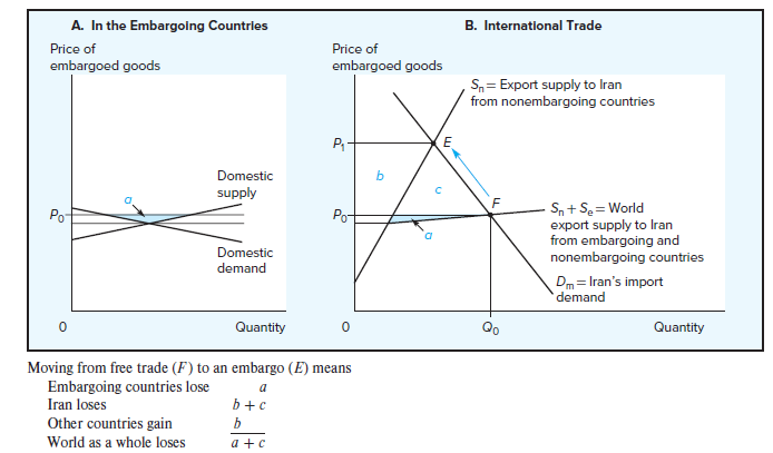
- Moving from free trade (F) to an embargo (E) means - Moving from free trade (F) to an embargo (E) means
Step by Step Solution
There are 3 Steps involved in it
1 Expert Approved Answer
Step: 1 Unlock

Question Has Been Solved by an Expert!
Get step-by-step solutions from verified subject matter experts
Step: 2 Unlock
Step: 3 Unlock