

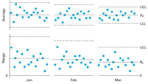
Question: Explain below two charts. How can these charts be used? Please interpret the results in below two charts. UCL Average LCL UCL Range 0 Jan.
Explain below two charts. How can these charts be used? Please interpret the results in below two charts.
Step by Step Solution
There are 3 Steps involved in it
1 Expert Approved Answer
Step: 1 Unlock

Question Has Been Solved by an Expert!
Get step-by-step solutions from verified subject matter experts
Step: 2 Unlock
Step: 3 Unlock