

Question: Sunday Saturday Friday How is this pie chart misleading? @ Percentages for each day are missing. O ThF uses a two-dimensional figure to represent

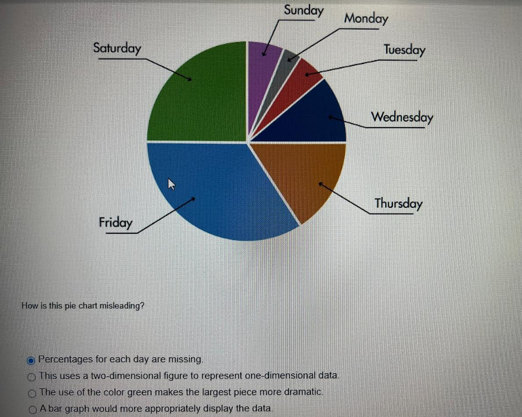
Sunday Saturday Friday How is this pie chart misleading? @ Percentages for each day are missing. O ThF uses a two-dimensional figure to represent one-dimensional data. O Th use of the color green makes the largest piece more dramatic. O A bar graph would more appropriately display the data. Monday Tuesday Wednesday Thursday
Step by Step Solution
There are 3 Steps involved in it
1 Expert Approved Answer
Step: 1 Unlock

Question Has Been Solved by an Expert!
Get step-by-step solutions from verified subject matter experts
Step: 2 Unlock
Step: 3 Unlock