

Question: First picture is the question. From Book - 2 Complete the following Case Study Assignment In the Offspring Case Study the company chose responsive design
First picture is the question. 
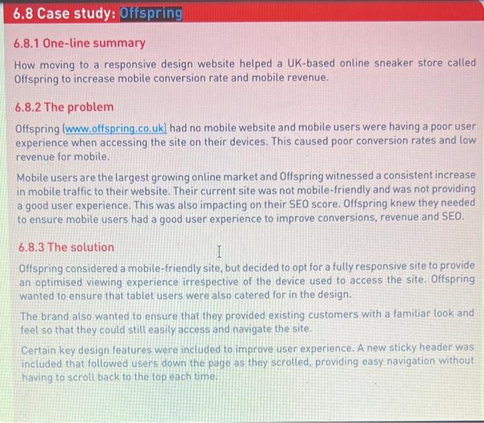
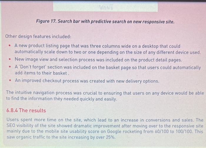
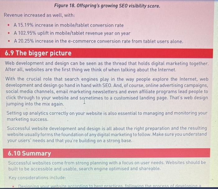
From Book - 2 Complete the following Case Study Assignment In the Offspring Case Study the company chose responsive design elements. Which two elements of the responsive design were most important in optimizing the user experience across a variety of devices? Why or Why not? Explain your answer. Provide references and sources. 200 to 300 words double spaced. Prepare your answer using word and then cut and paste in the box provided. This is a multi-part question. Your answer should reflect this. Avoid one long paragraph answers. Such answers will receive lower scores. 6.8.1 One-line summary How moving to a responsive design website helped a UK-based online sneaker store called offspring to increase mobile conversion rate and mobile revenue. 6.8.2 The problem Offspring had no mobile website and mobile users were having a poor user experience when accessing the site on their devices. This caused poor conversion rates and low revenue for mobile. Mobile users are the largest growing online market and Offspring witnessed a consistent increase in mobile traffic to their website. Their current site was not mobile-friendly and was not providing a good user experience. This was also impacting on their SEO score. Offspring knew they needed to ensure mobile users had a good user experience to improve conversions, revenue and SEO. 6.8.3 The solution Offspring considered a mobile-friendly site, but decided to opt for a fully responsive site to provide an optimised viewing experience irrespective of the device used to access the site. Offspring wanted to ensure that tablet users were also catered for in the design. The brand also wanted to ensure that they provided existing customers with a familiar look and feel so that they could still easily access and navigate the site. Certain key design features were included to improve user experience. A new sticky header was included that followed users down the page as they scrolled, providing easy navigation without having to scroll back to the top each time. Figure 17. Search bar with predictive search on new responsive site. Other design features included: - A new product listing page that was three columns wide on a desktop that could automatically scale down to two or one depending on the size of any different device used. - New image view and selection process was included on the product detail pages. - A'Don't forget' section was included on the basket page so that users could automatically add items to their basket. - An improved checkout process was created with new delivery options. The intuitive navigation process was crucial to ensuring that users on any device would be able to find the information they needed quickly and easily. 6.8.4 The results Users spent more time on the site, which lead to an increase in conversions and sales. The SEO visibility of the site showed dramatic improvement after moving over to the responsive site mainly due to the mobile site usability score on Google rocketing from 60/100 to 100/100. This saw organic traffic to the site increasing by over 25%. Figure 18. Offspring's growing SEO visibility score. Revenue increased as well, with: - A 15.19% increase in mobile/tablet conversion rate - A 102.95% uplift in mobile/tablet revenue year on year - A 20.25% increase in the e-commerce conversion rate from tablet users alone. 6.9 The bigger picture Web development and design can be seen as the thread that holds digital marketing together. After all, websites are the first thing we think of when talking about the Internet. With the crucial role that search engines play in the way people explore the Internet, web development and design go hand in hand with SEO. And, of course, online advertising campaigns, social media channels, email marketing newsletters and even affiliate programs lead people to click through to your website and scmetimes to a customised landing page. That's web design jumping into the mix again. Setting up analytics correctly on your website is also essential to managing and monitoring your marketing success. Successful website development and design is all about the right preparation and the resulting website usually form s the foundation of any digital marketing to follow. Make sure you understand your users' needs and that you're building on a strong base. 6.10 Summary Successful websites come from strong planning with a focus on user needs. Websites should be buitt to be accessible and usable, search engine optimised and shareable. Key considerations include: your users' needs and that you're building on a strong base. 6.10 Summary Successful websites come from strong planning with a focus on user needs. Websites should be built to be accessible and usable, search engine optimised and shareable. Key considerations include: - Designing your website according to best practices, following the process of developing a website from start to finish - Developing a strong, stable and usable website - Creating a suitable mobile web experience for your users - Enhancing user experience through design and guiding a visitor seamlessly through a website, as opposed to distracting visitors from their goals - Ensuring consistency in visual messaging across all properties - Supporting a wide range of web browsers and mobile devices
Step by Step Solution
There are 3 Steps involved in it
1 Expert Approved Answer
Step: 1 Unlock

Question Has Been Solved by an Expert!
Get step-by-step solutions from verified subject matter experts
Step: 2 Unlock
Step: 3 Unlock
 Study Help