

Question: FOLLOQ THE DIRECTIONS Hands-On Practice 7.11 In this Hands-On Practice you'll use flexbox layout to configure a three-column layout Figure 7.32) on a web page
FOLLOQ THE DIRECTIONS

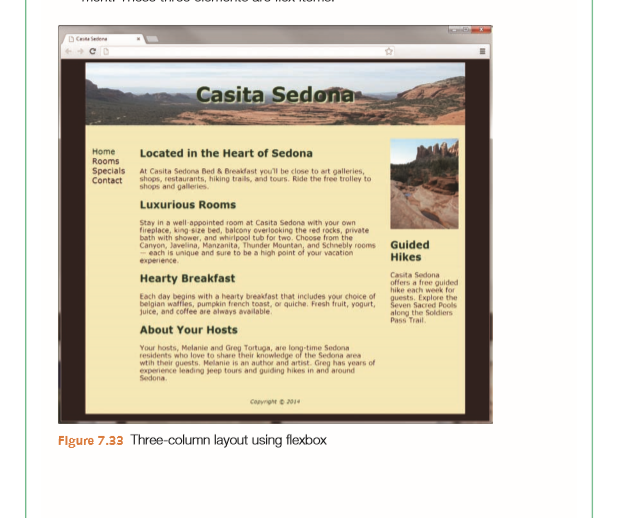
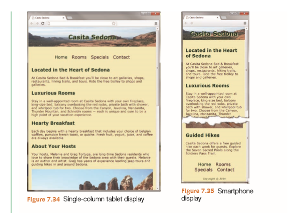
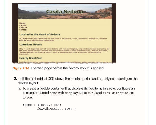
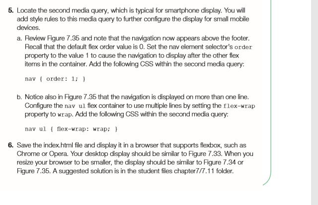
Hands-On Practice 7.11 In this Hands-On Practice you'll use flexbox layout to configure a three-column layout Figure 7.32) on a web page and also apply media queries to modify the display for mobile devices. Figure 7.33 shows the three-column desktop browser display You'll configure the desktop browser display first and then modify the media queries to configure a single-column tablet display with horizontal navigation (Figure 7.34) anda single-column smartphone display with navigation reordered to appear above the footer (Figure 7.35) Create a folder named flexbox7. Copy the starter5.html file from the chapter7 folder into the flexbox7 folder and rename it as index.html. Copy the following images from the student files chapter7/starters folder into the flexbox7 folder: header.jpg and pools.jpg. When you launch a browser to view the index.html file, it will look similar to Figure 7.36 with a single-column layout. 1. View the code in a text editor and locate the openigdiv tag coded above the nav element-this is the beginning of the flexible container. Edit the HTML and assign this div to an id named demo. Notice that three elements are contained within the #demo div: the nav element, the main element, and the aside ele- ment. These three elements are flex items. Hands-On Practice 7.11 In this Hands-On Practice you'll use flexbox layout to configure a three-column layout Figure 7.32) on a web page and also apply media queries to modify the display for mobile devices. Figure 7.33 shows the three-column desktop browser display You'll configure the desktop browser display first and then modify the media queries to configure a single-column tablet display with horizontal navigation (Figure 7.34) anda single-column smartphone display with navigation reordered to appear above the footer (Figure 7.35) Create a folder named flexbox7. Copy the starter5.html file from the chapter7 folder into the flexbox7 folder and rename it as index.html. Copy the following images from the student files chapter7/starters folder into the flexbox7 folder: header.jpg and pools.jpg. When you launch a browser to view the index.html file, it will look similar to Figure 7.36 with a single-column layout. 1. View the code in a text editor and locate the openigdiv tag coded above the nav element-this is the beginning of the flexible container. Edit the HTML and assign this div to an id named demo. Notice that three elements are contained within the #demo div: the nav element, the main element, and the aside ele- ment. These three elements are flex items
Step by Step Solution
There are 3 Steps involved in it

Get step-by-step solutions from verified subject matter experts
 Study Help