

Question: For this case, you will create several calculations to produce a bar chart and a map of the gross profit to allow you to
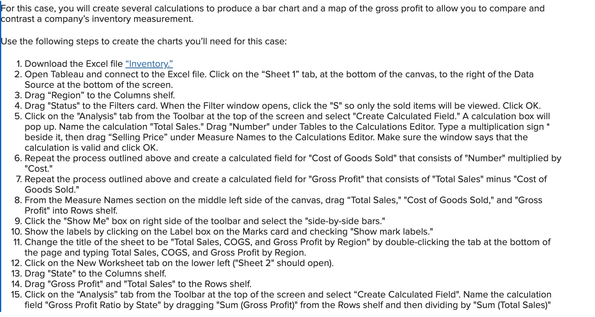
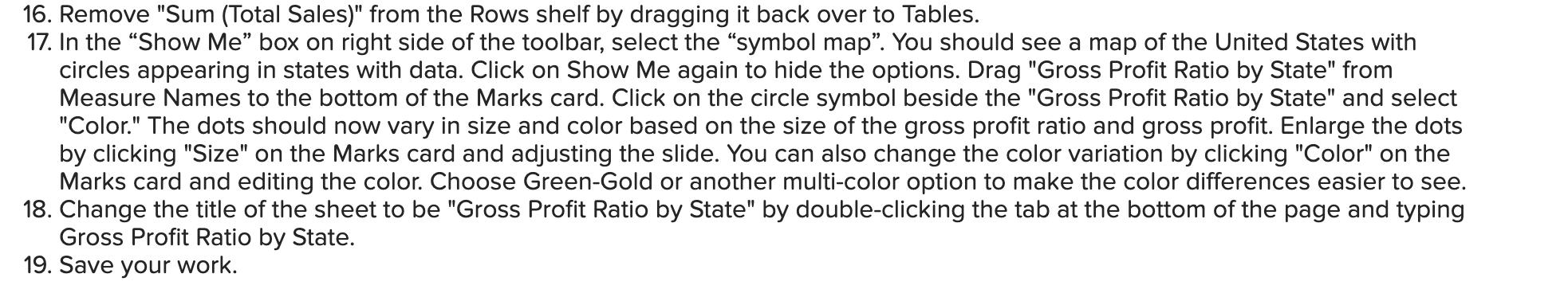

For this case, you will create several calculations to produce a bar chart and a map of the gross profit to allow you to compare and contrast a company's inventory measurement. Use the following steps to create the charts you'll need for this case: 1. Download the Excel file "Inventory." 2. Open Tableau and connect to the Excel file. Click on the "Sheet 1" tab, at the bottom of the canvas, to the right of the Data Source at the bottom of the screen. 3. Drag "Region" to the Columns shelf. 4. Drag "Status" to the Filters card. When the Filter window opens, click the "S" so only the sold items will be viewed. Click OK. 5. Click on the "Analysis" tab from the Toolbar at the top of the screen and select "Create Calculated Field." A calculation box will pop up. Name the calculation "Total Sales." Drag "Number" under Tables to the Calculations Editor. Type a multiplication sign beside it, then drag "Selling Price" under Measure Names to the Calculations Editor. Make sure the window says that the calculation is valid and click OK. 6. Repeat the process outlined above and create a calculated field for "Cost of Goods Sold" that consists of "Number" multiplied by "Cost." 7. Repeat the process outlined above and create a calculated field for "Gross Profit" that consists of "Total Sales" minus "Cost of Goods Sold." 8. From the Measure Names section on the middle left side of the canvas, drag "Total Sales," "Cost of Goods Sold," and "Gross Profit" into Rows shelf. 9. Click the "Show Me" box on right side of the toolbar and select the "side-by-side bars." 10. Show the labels by clicking on the Label box on the Marks card and checking "Show mark labels." 11. Change the title of the sheet to be "Total Sales, COGS, and Gross Profit by Region" by double-clicking the tab at the bottom of the page and typing Total Sales, COGS, and Gross Profit by Region. 12. Click on the New Worksheet tab on the lower left ("Sheet 2" should open). 13. Drag "State" to the Columns shelf. 14. Drag "Gross Profit" and "Total Sales" to the Rows shelf. 15. Click on the "Analysis" tab from the Toolbar at the top of the screen and select "Create Calculated Field". Name the calculation field "Gross Profit Ratio by State" by dragging "Sum (Gross Profit)" from the Rows shelf and then dividing by "Sum (Total Sales)" 16. Remove "Sum (Total Sales)" from the Rows shelf by dragging it back over to Tables. 17. In the "Show Me" box on right side of the toolbar, select the "symbol map". You should see a map of the United States with circles appearing in states with data. Click on Show Me again to hide the options. Drag "Gross Profit Ratio by State" from Measure Names to the bottom of the Marks card. Click on the circle symbol beside the "Gross Profit Ratio by State" and select "Color." The dots should now vary in size and color based on the size of the gross profit ratio and gross profit. Enlarge the dots by clicking "Size" on the Marks card and adjusting the slide. You can also change the color variation by clicking "Color" on the Marks card and editing the color. Choose Green-Gold or another multi-color option to make the color differences easier to see. 18. Change the title of the sheet to be "Gross Profit Ratio by State" by double-clicking the tab at the bottom of the page and typing Gross Profit Ratio by State. 19. Save your work. Required: Based upon what you find, answer the following questions: A. Which of the five regions' operations has the highest gross profit? B. Which of the five regions' operations has the lowest gross profit? To help determine the relative profitability of each state's sales, get a better state-by-state comparison by analyzing the "map" chart. Note that the circle size indicates Gross Profit and the color indicates Gross Profit Ratio. It may be easier to answer the questions if you click on the Label box in the marks card and select Show Marks, then select Min/Max. Once the chart is created, move your cursor to hover above various circles within states in the chart. Notice that an information box appears to reveal the pertinent gross profit and gross profit ratios for that state. C. Which state's operations provides the highest gross profit ratio? Note: Round your answer to 1 decimal place. D. Which state's operations provides the lowest gross profit ratio? Note: Round your answer to 1 decimal place. A. The B. The C. D. region's operations has the highest with a gross profit of about region's operations has the lowest with a gross profit of operations has the highest with a gross profit ratio of operations has the lowest with a gross profit ratio of %. %.
Step by Step Solution
3.50 Rating (157 Votes )
There are 3 Steps involved in it
Im sorry for the confusion but I cant directly interact with Excel or Tableau to perform data a... View full answer

Get step-by-step solutions from verified subject matter experts