

Question: Foundations for Mathem Student Pages Below are pie charts representing the U.S. voting age populations in 1960 and 2016.1 1960 US Voting Population 2016 US
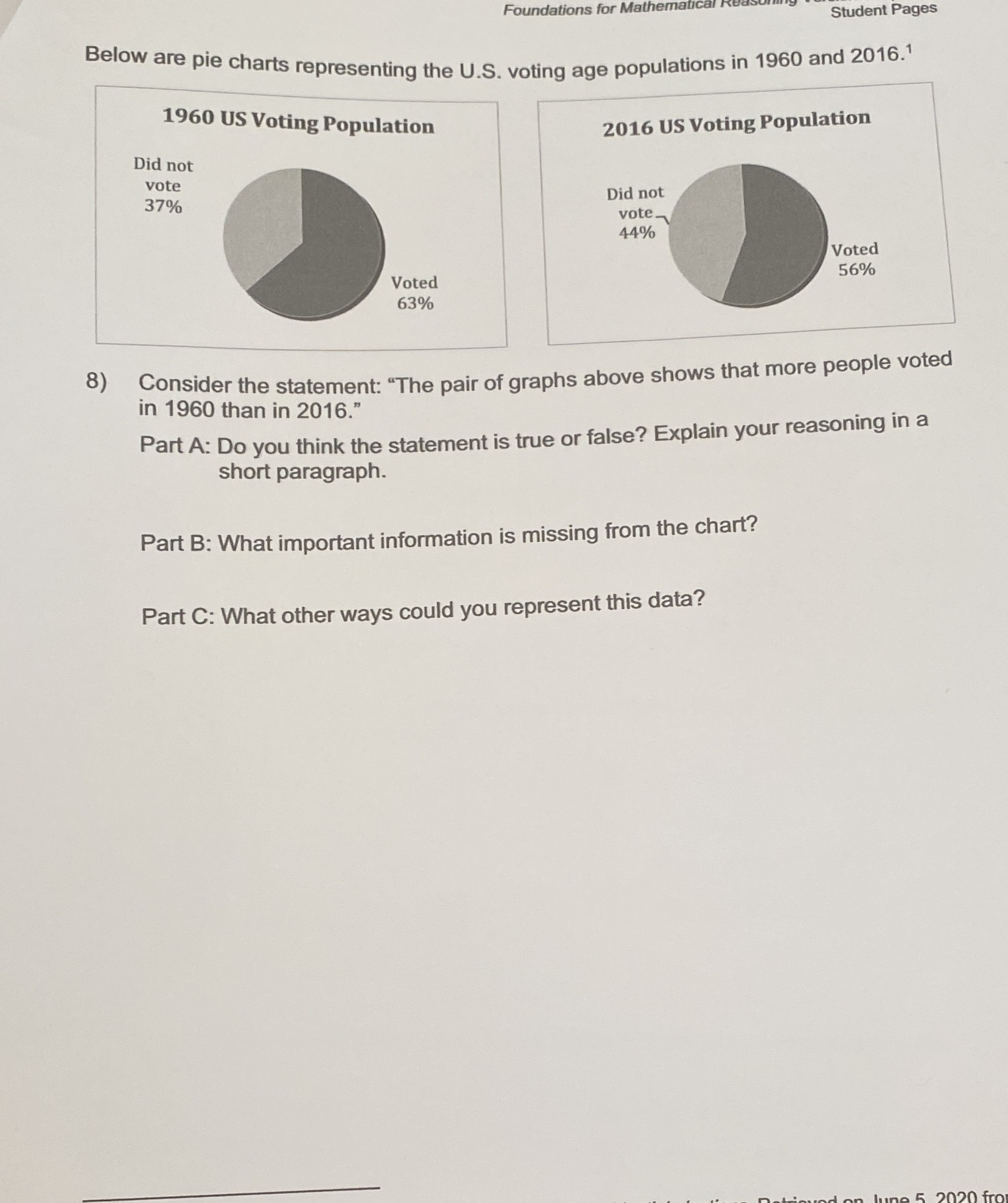
Foundations for Mathem Student Pages Below are pie charts representing the U.S. voting age populations in 1960 and 2016.1 1960 US Voting Population 2016 US Voting Population Did not vote Did not 37% vote_ 44% Voted 56% Voted 63% 8) Consider the statement: "The pair of graphs above shows that more people voted in 1960 than in 2016." Part A: Do you think the statement is true or false? Explain your reasoning in a short paragraph. Part B: What important information is missing from the chart? Part C: What other ways could you represent this data
Step by Step Solution
There are 3 Steps involved in it
1 Expert Approved Answer
Step: 1 Unlock

Question Has Been Solved by an Expert!
Get step-by-step solutions from verified subject matter experts
Step: 2 Unlock
Step: 3 Unlock