

Question: geoMap.csv GGtrend_HCQ_2020.csv HCQ_event.csv tweets_manual_classifying.csv Import libraries #libraries import pandas as pd import matplotlib.pyplot as plt import seaborn as sns Task
geoMap.csv
GGtrend_HCQ_2020.csv

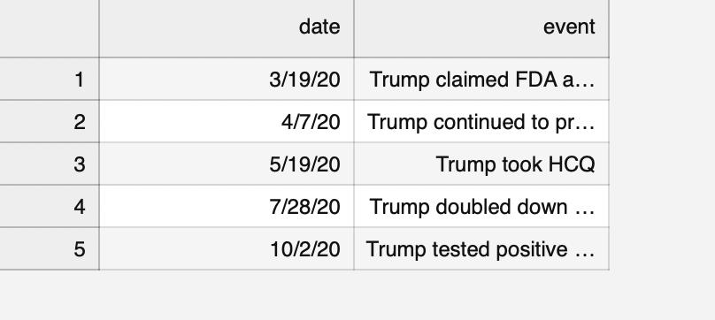
HCQ_event.csv
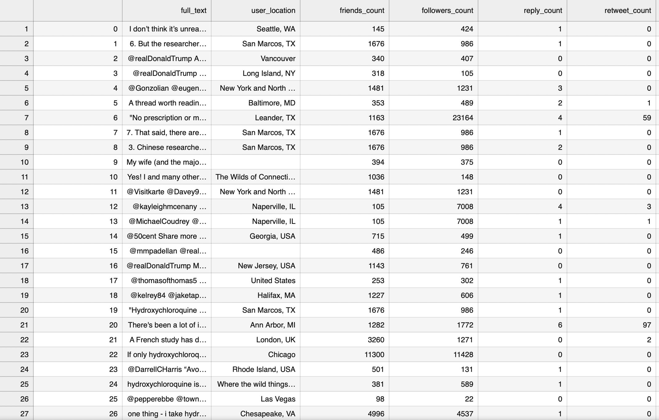
tweets_manual_classifying.csv

Import libraries
#libraries import pandas as pd import matplotlib.pyplot as plt import seaborn as sns
Task 1:
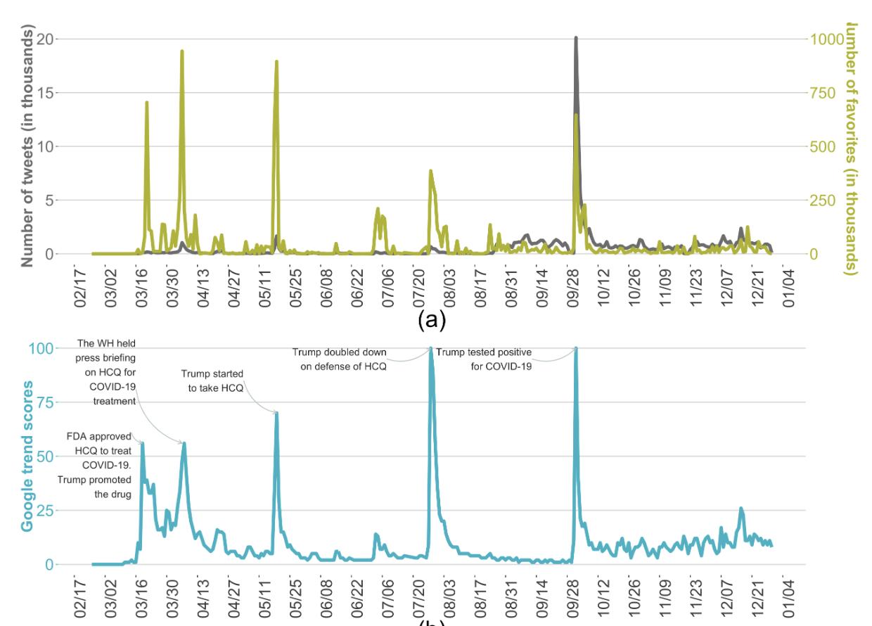
We want to see the online users' reaction patterns in the time domain, including (a) Number of tweets, favorites on Twitter, (b) Google keyword search score.
Make the following plot. You can take the events of the plot from the HCQ_event.csv file. Your figure should look similar (though not necessarily identical)
# YOUR CODE HERE raise NotImplementedError()
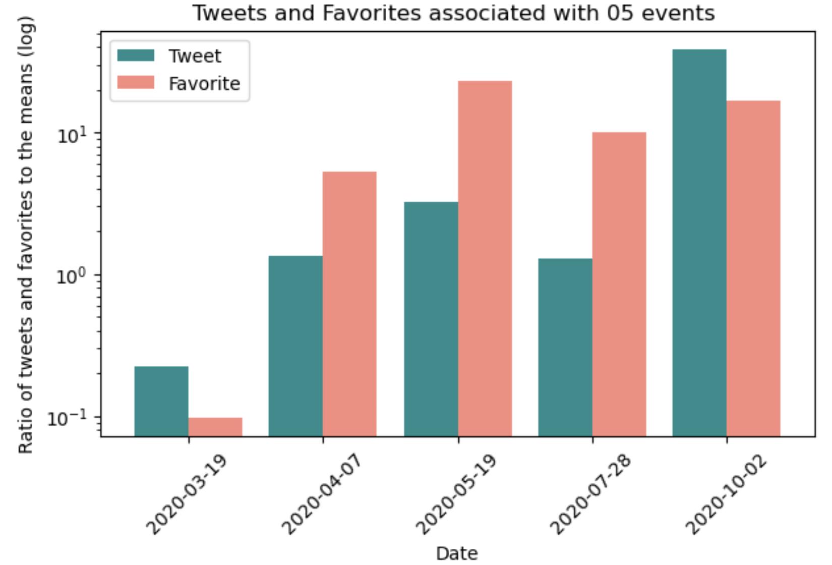
Task 2:
We want to look closer at the number of tweets and favorites sent out on the five above days (the days you made annotations on)
Make the following plot. Your figure should look similar (though not necessarily identical)
In this plot,
the teal bars = #tweets on an event day / mean of #tweets on a day
the salmon bars = #favorites on an event day / mean of #favorites on a day
# YOUR CODE HERE
raise NotImplementedError()
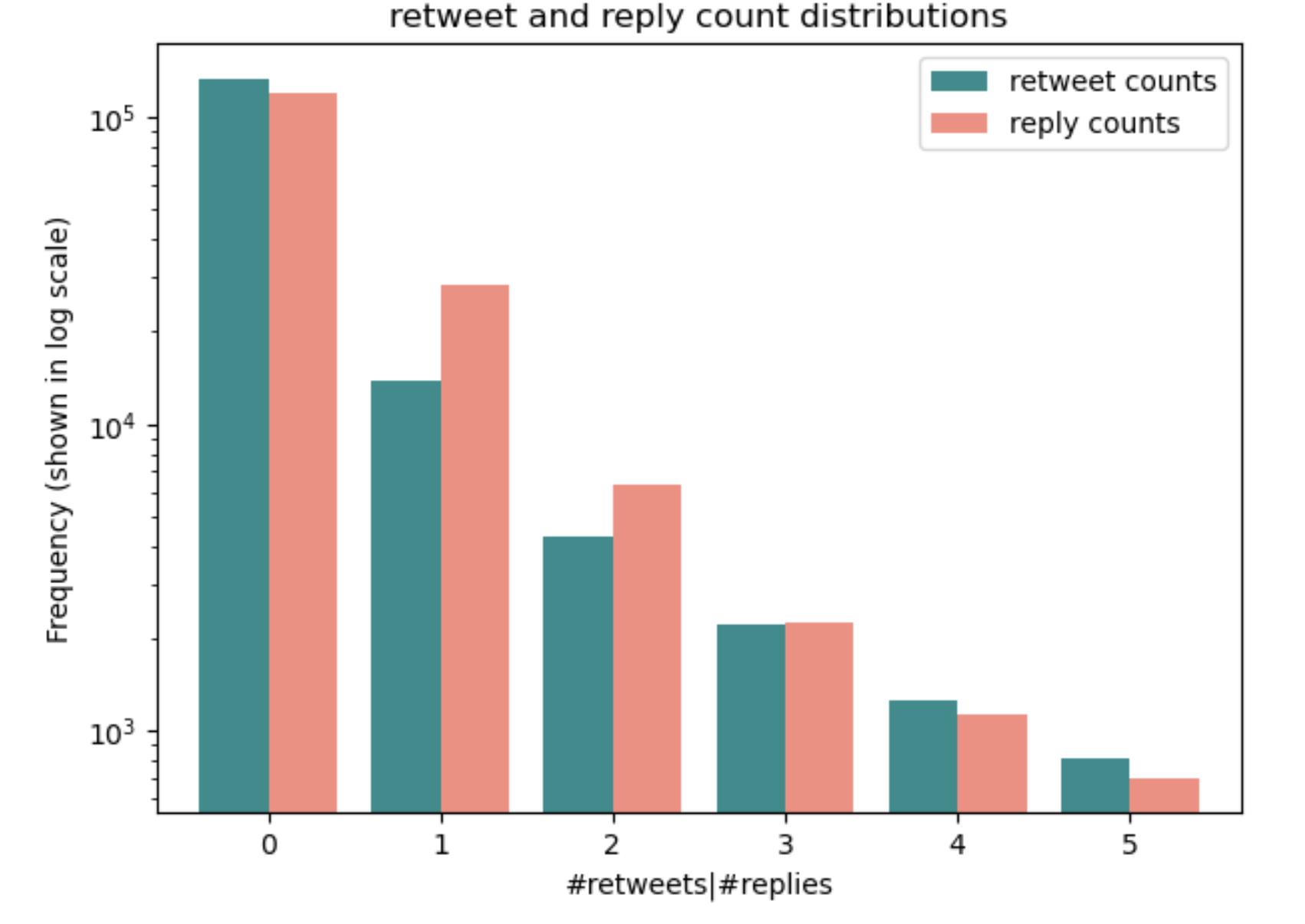
Task 3:
We want to see the distributions of reply_count and retweet_count for a tweet.
Make the following plot. Your figure should look similar (though not necessarily identical)
# YOUR CODE HERE raise NotImplementedError()
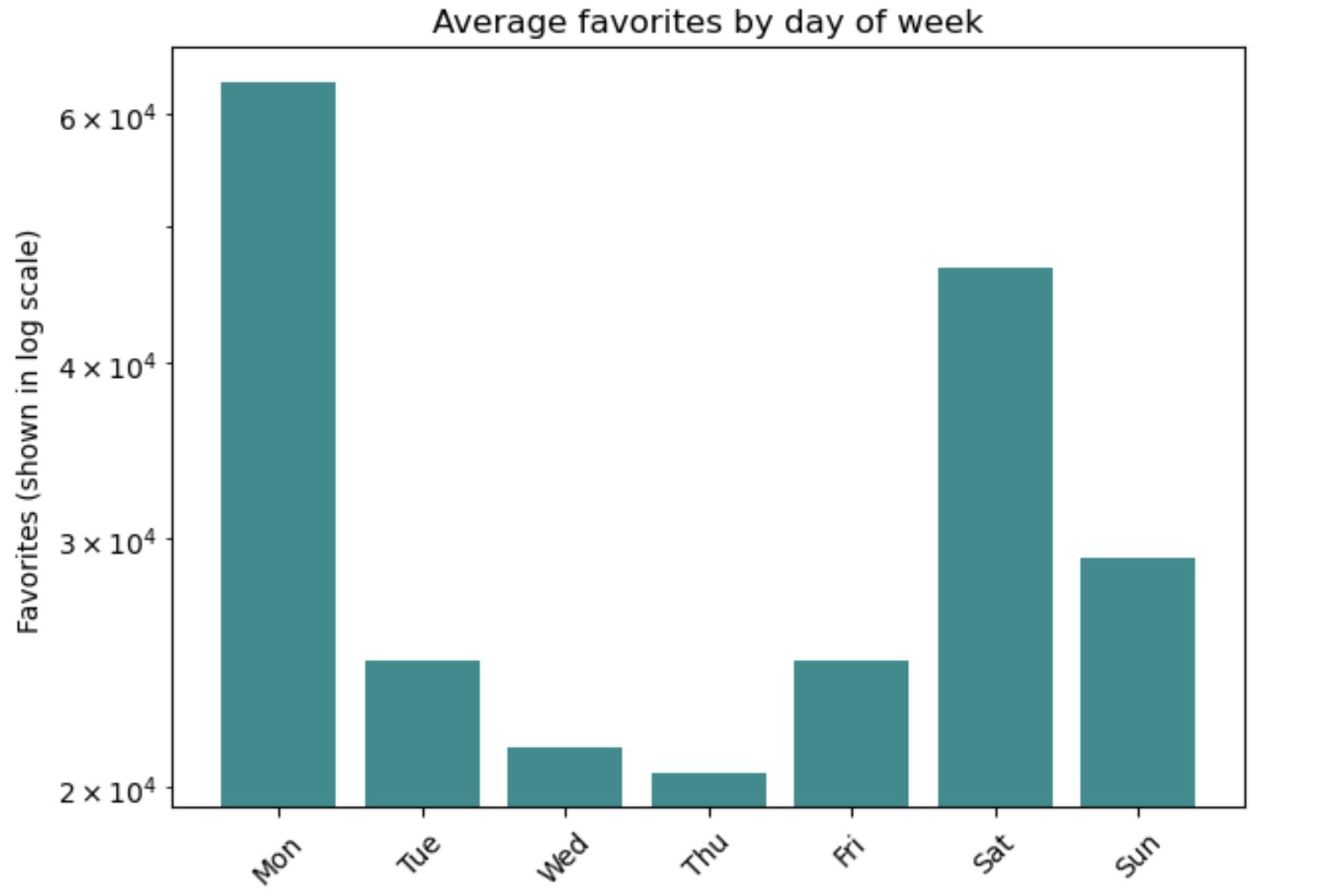
Task 4:
We want to look see if there is any patterns of posted tweets and favorites over days of weeks.
Make the following plot. Your figure should look similar (though not necessarily identical)
# YOUR CODE HERE raise NotImplementedError()
Task 5:
We want to look see if there is any relationships between the number of tweets and the number of favorites sending out on a day.
Make the following plot. Your figure should look similar (though not necessarily identical)

# YOUR CODE HERE raise NotImplementedError()
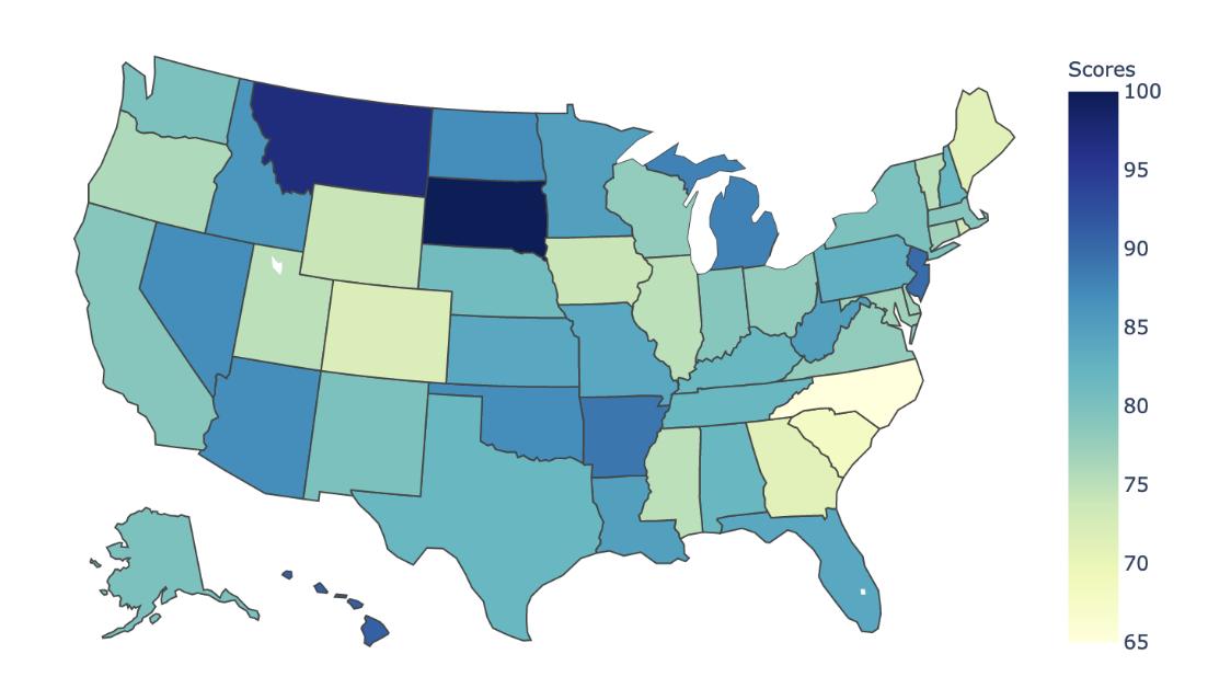
Task 6:
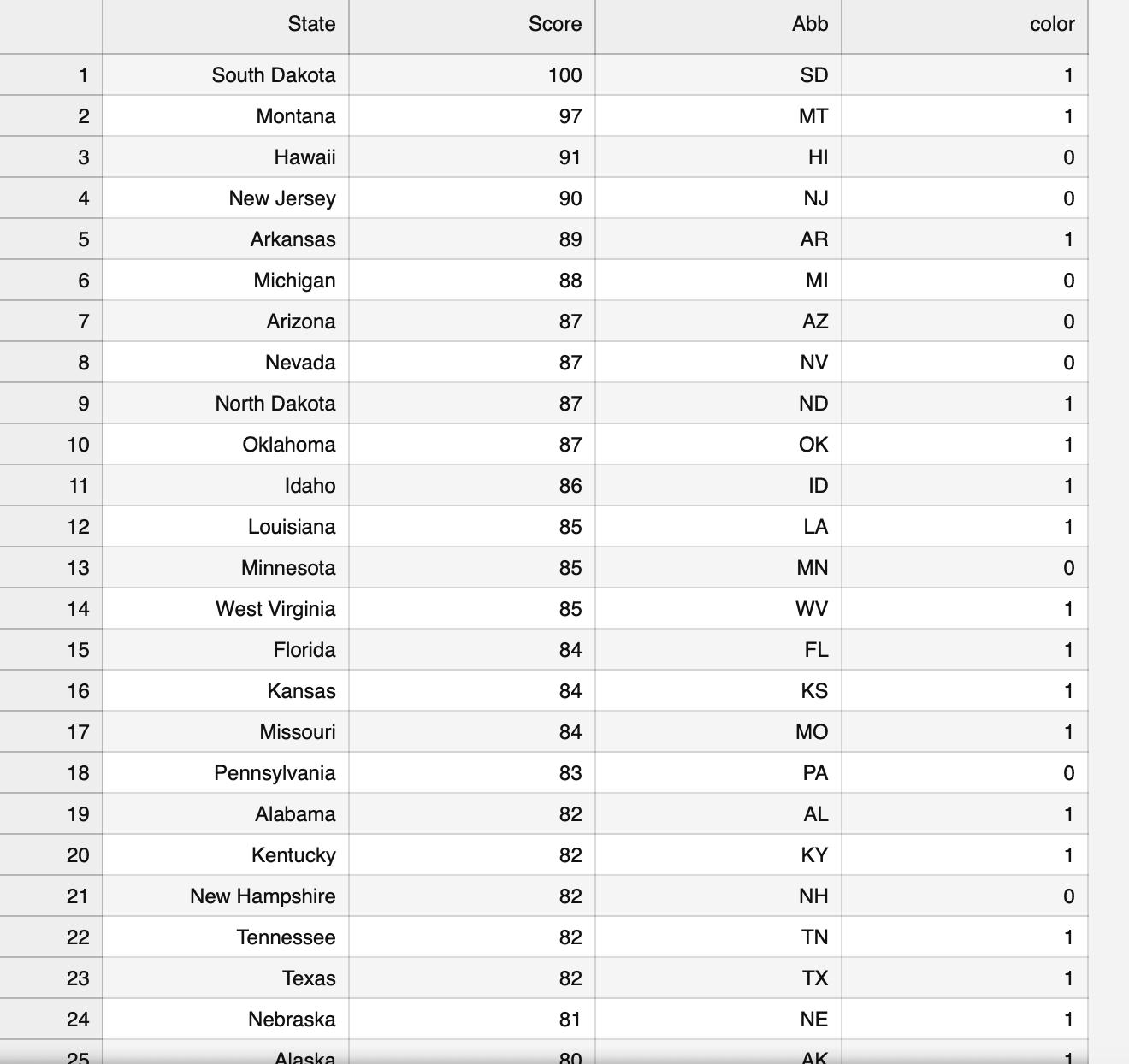
Use the geoMap.csv file to produce a heatmap of Google HCQ searching score over states in the US.
Make the following plot. Your figure should look similar (though not necessarily identical)
# YOUR CODE HERE raise NotImplementedError()
Task 7:
Use the tweets_manual_classifying.csv file to produce wordcloud plots
(a) Most frequently used words,
(b) Positive vs. negative words using "Bing" lexicon
Make the following plot. Your figure should look similar (though not necessarily identical)

raise NotImplementedError()
1 2 3 4 5 6 7 8 9 10 11 12 13 14 15 16 17 18 19 20 21 22 23 24 25 State South Dakota Montana Hawaii New Jersey Arkansas Michigan Arizona Nevada North Dakota Oklahoma Idaho Louisiana Minnesota West Virginia Florida Kansas Missouri Pennsylvania Alabama Kentucky New Hampshire Tennessee Texas Nebraska Alaska Score 100 97 91 90 89 88 87 87 87 87 86 85 85 85 84 84 84 83 82 82 82 82 82 81 80 Abb SD MT HI NJ AR MI AZ NV ND OK ID LA MN WV FL KS MO PA AL KY NH TN TX NE AK color 1 1 0 0 1 0 0 0 1 1 1 1 0 1 1 1 1 0 1 1 0 1 1 1 1
Step by Step Solution
There are 3 Steps involved in it

Get step-by-step solutions from verified subject matter experts