Question: Getting started Graph quantity (x-axis) v price (y-axis) for the business and youth segment. So you should have two separate charts. Add a trendline to
Getting started Graph quantity (x-axis) v price

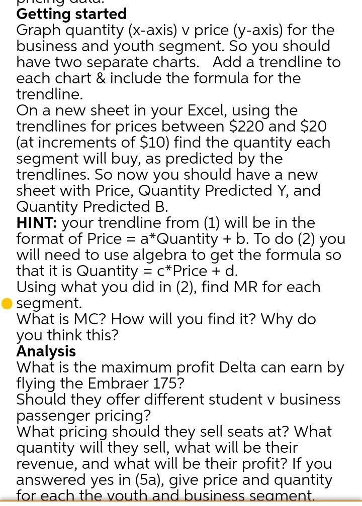
Getting started Graph quantity (x-axis) v price (y-axis) for the business and youth segment. So you should have two separate charts. Add a trendline to each chart & include the formula for the trendline. On a new sheet in your Excel, using the trendlines for prices between $220 and $20 (at increments of $10) find the quantity each segment will buy, as predicted by the trendlines. So now you should have a new sheet with Price, Quantity Predicted Y, and Quantity Predicted B. HINT: your trendline from (1) will be in the format of Price = a*Quantity + b. To do (2) you will need to use algebra to get the formula so that it is Quantity = c* Price + d. Using what you did in (2), find MR for each segment. What is MC? How will you find it? Why do you think this? Analysis What is the maximum profit Delta can earn by flying the Embraer 175? Should they offer different student v business passenger pricing? What pricing should they sell seats at? What quantity will they sell, what will be their revenue, and what will be their profit? If you answered yes in (5a), give price and quantity for each the vouth and business seament

Step by Step Solution

There are 3 Steps involved in it

1 Expert Approved Answer
Step: 1 Unlock blur-text-image
Question Has Been Solved by an Expert!

Get step-by-step solutions from verified subject matter experts

Step: 2 Unlock
Step: 3 Unlock

Students Have Also Explored These Related General Management Questions!