

Question: Got it ! After renaming the graph, here are the steps you can follow: 1 . * * Analyze the Data: * * - Look
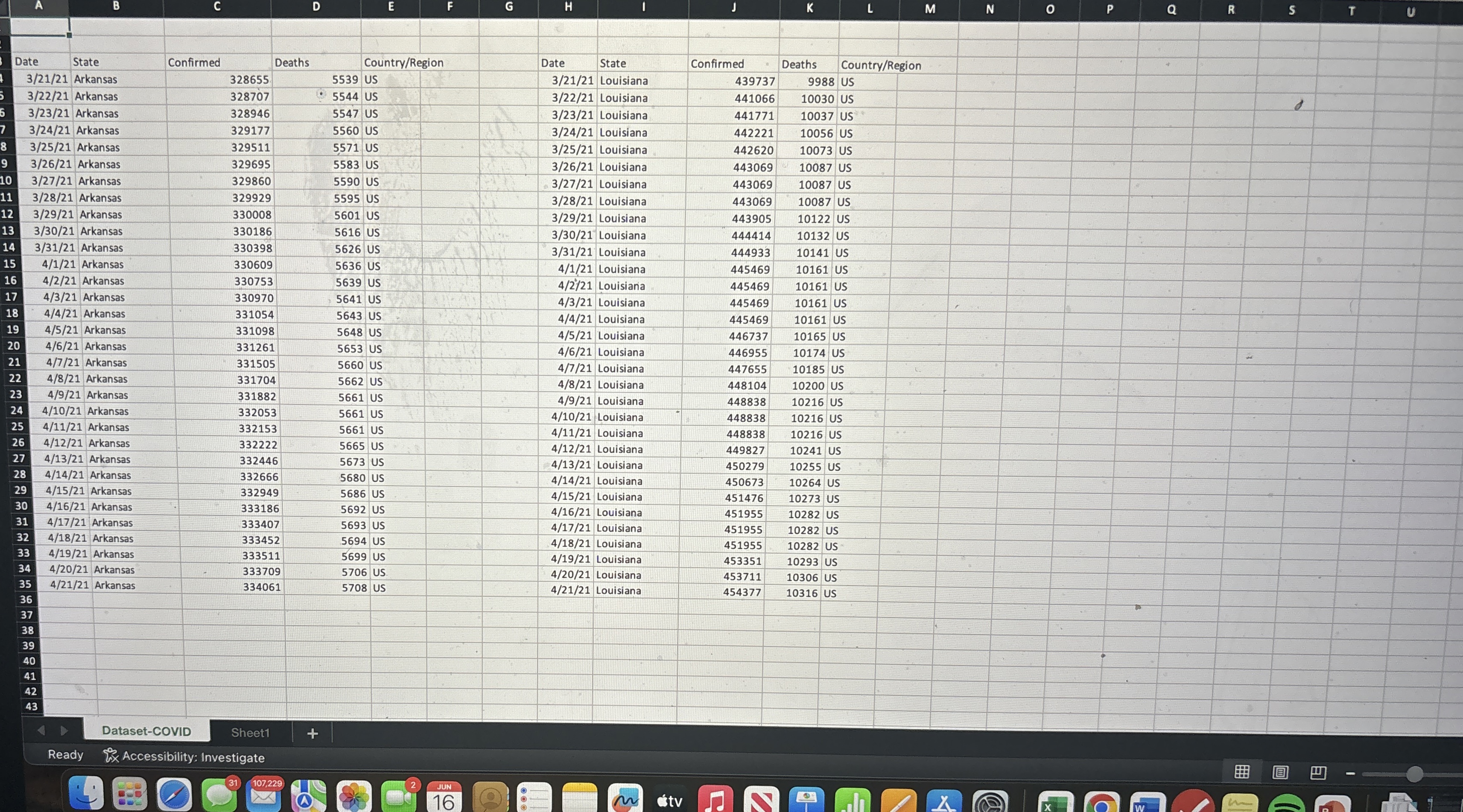
Got it After renaming the graph, here are the steps you can follow:Analyze the Data: Look at the data in the TA tab. You should analyze the confirmed cases and deaths for both Arkansas and Louisiana. Calculate any statistics or metrics that might be required, such as total confirmed cases, total deaths, or any trends over timeCreate Visualizations: Use Excel to create graphs or charts that help visualize the data. For example, you could create a line chart to show the trend of confirmed cases over time for both states. To create a chart, highlight the relevant data, go to the "Insert" tab, and select the type of chart you want to createAdd Annotations: Make sure your graphs are clearly labeled. Add titles, axis labels, and legends as needed. You can also add data labels to show specific values on the graphInterpret the Data: Write a brief summary of your findings. What do the trends show? Are there any significant differences between Arkansas and Louisiana? This summary can be added as a text box within the Excel sheet or in a separate document if requiredSave and Submit: Once you have completed your analysis and created the necessary visualizations, save your work. Follow any submission guidelines provided by your instructor to ensure you turn in the assignment correctly.If you need help with any specific part of this process, feel free to ask!
Step by Step Solution
There are 3 Steps involved in it
1 Expert Approved Answer
Step: 1 Unlock

Question Has Been Solved by an Expert!
Get step-by-step solutions from verified subject matter experts
Step: 2 Unlock
Step: 3 Unlock