

Question: Graph A Graph B Graph C Graph D Perks Quantity Quantity Observe the illustration above. Which ONE of the four graphs shown would best show
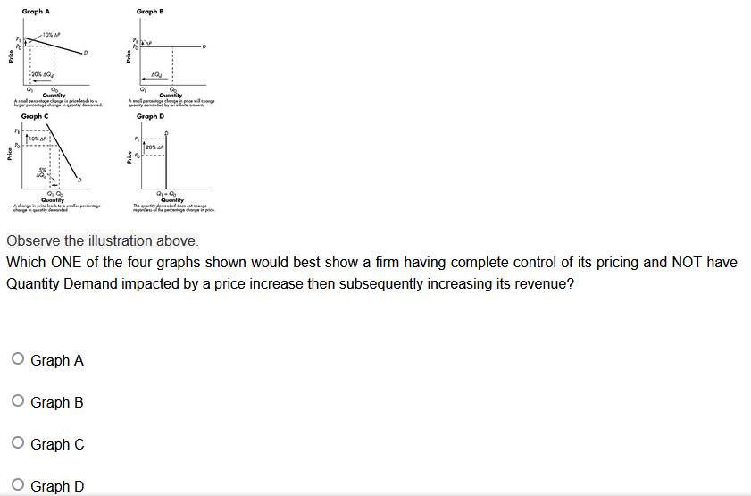
Graph A Graph B Graph C Graph D Perks Quantity Quantity Observe the illustration above. Which ONE of the four graphs shown would best show a firm having complete control of its pricing and NOT have Quantity Demand impacted by a price increase then subsequently increasing its revenue? O Graph A O Graph B O Graph C O Graph D
Step by Step Solution
There are 3 Steps involved in it
1 Expert Approved Answer
Step: 1 Unlock

Question Has Been Solved by an Expert!
Get step-by-step solutions from verified subject matter experts
Step: 2 Unlock
Step: 3 Unlock