

Graphical displays are used to provide the viewer information that illustrates qualitative or quantitative information about the
Question:
Graphical displays are used to provide the viewer information that illustrates qualitative or quantitative information about the data set under review. After reading the assigned sections in Chapter 2, provide an example of where you think a graphical display could be used incorrectly. What ramification(s) do you think could result from the graphical display in your example being used incorrectly?
Chapter 2 - Overview
GRAPHICAL DISPLAYS OF DATA
In Chapter 2, we look at ways to display our data and the different methods and types that are used. You will find that not all graphical displays can be used to describe every type of data. For instance, the graphical methods that we use to display qualitative variables may not be appropriate to display quantitative variables. That fact will become evident to you as you progress through this learning unit.
Fundamental Principles for Displaying Data
Follow these principles when presenting data that has been collected.
- Graphical method must fit the type of data.
- Graphs and charts should be simple and easy to understand.
- Information should be clearly defined and labeled.
- Graphs should be “visual” to the audience. You should not leave your audience guessing as to what the data display is about.
Look at the graphs and charts displayed in Sections 2.1 and 2.2 in your text and see how they meet the principles above.
There are two graphing types:
- Graphs and charts used to display qualitative data.
- Graphs and charts used to display quantitative data.
Types of Qualitative Data Graphs
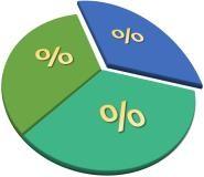
| Pie Chart – a circle graph that shows the proportion of each category as a “slice” of a pie. |
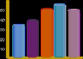
| Bar Graph – each category is shown as a vertical rectangular area whose height gives the proportion of that category. |
| Pareto Diagram – a bar graph arranged from the category with the highest frequency to the category with the lowest frequency. These are useful tools for identifying possible causes of problems and to help someone determine what the best courses of action might be. |
Types of Quantitative Data Graphs - Used to show the distribution of data
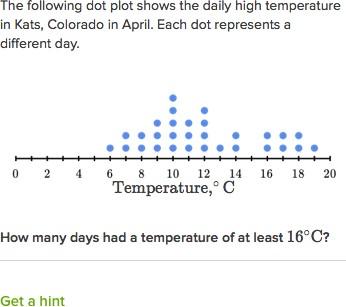
| Dot Plot Display – Each data point is represented by a dot positioned along a scale. |
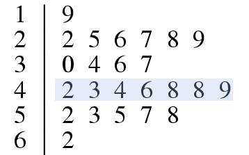
| Stem and Leaf Display – Each data point is displayed using the digits that make up its numerical value. |
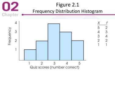
| Frequency Distribution – Used with large data sets. Each numerical value is paired with its frequency. There are two types:
|
| Histogram – A graph of a distribution. |
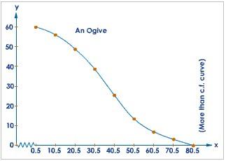
Familiarize yourself with how to construct and interpret a Cumulative Frequency Distribution. With a cumulative frequency distribution, we can construct an Ogive Curve to determine percentiles. Percentiles tell us the percent of a distribution that falls below a certain number or point. Using percentiles, we can determine how a certain value compares in relation to other values. For example, when a physician tells a parent that their child is at the 90th percentile for height, we know that the child is tall because the child is as tall as, or taller than, 90 percent of all children at that age. Only 10 percent of children at that age are taller.
Expert Answer:
Misleading Graphs The graphs are very powerful form of communication devices to disseminate informat... View the full answer

