

Question: Graphs are powerful statistical tools that can help reveal patterns in datasets. However, like any tool, they are sometimes used inappropriately, which can lead to
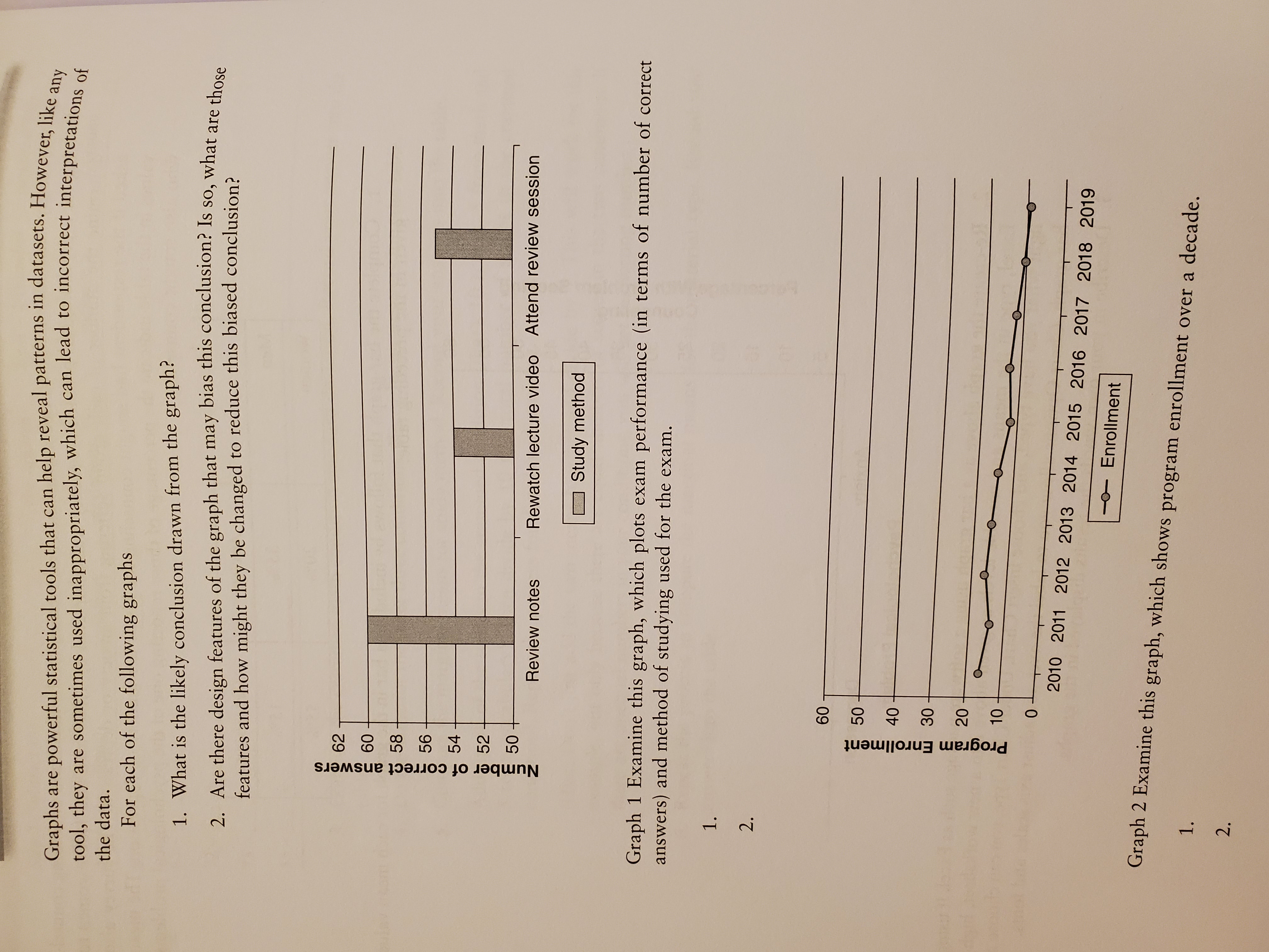
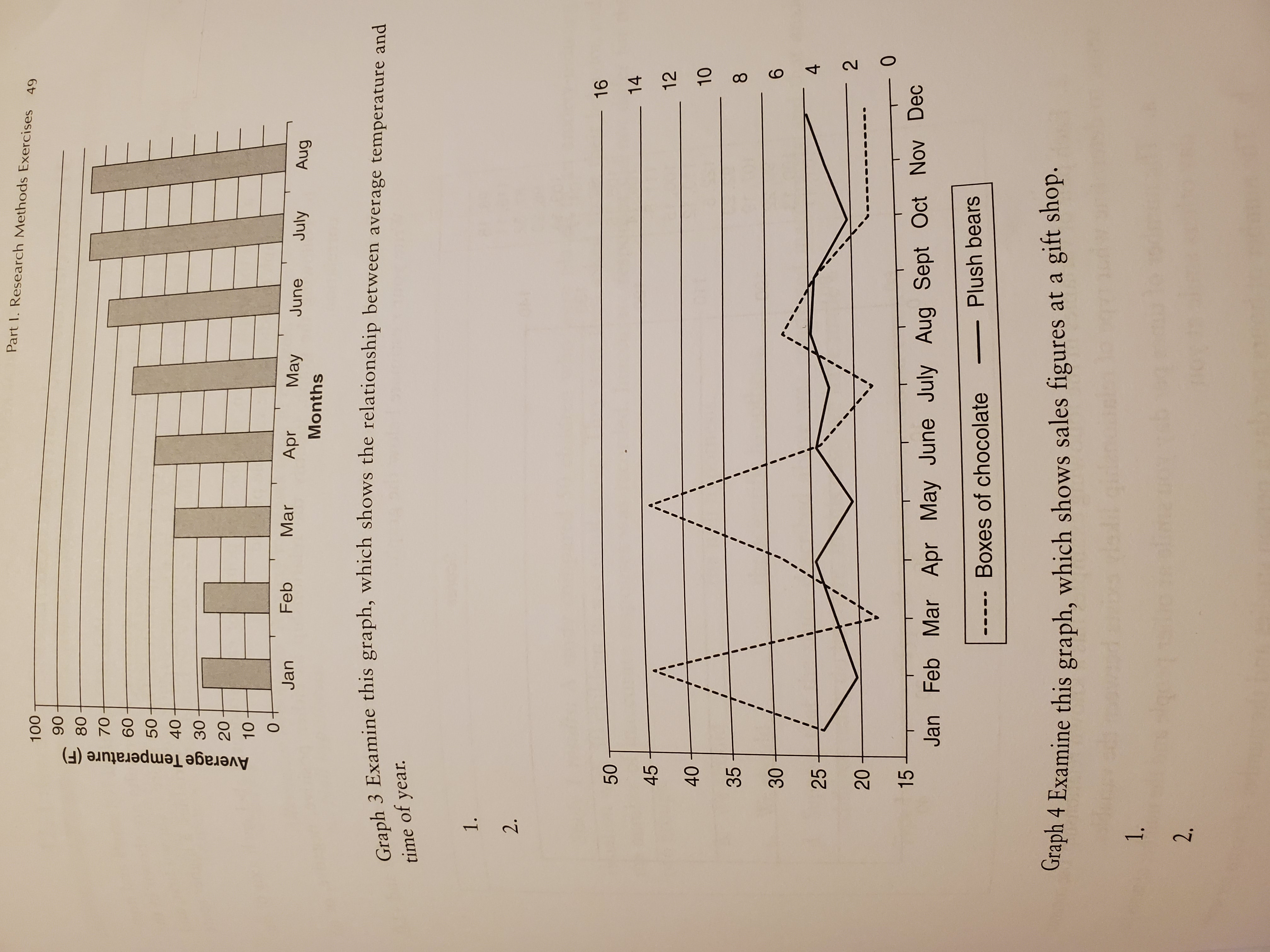
Graphs are powerful statistical tools that can help reveal patterns in datasets. However, like any tool, they are sometimes used inappropriately, which can lead to incorrect interpretations of the data. For each of the following graphs 1. What is the likely conclusion drawn from the graph? 2. Are there design features of the graph that may bias this conclusion? Is so, what are those features and how might they be changed to reduce this biased conclusion? Number of correct answers Review notes Rewatch lecture video Attend review session Study method Graph 1 Examine this graph, which plots exam performance (in terms of number of correct answers) and method of studying used for the exam. 2. 60 50 Program Enrollment 30 20 10 -a O 2010 2011 2012 2013 2014 2015 2016 2017 2018 2019 - Enrollment Graph 2 Examine this graph, which shows program enrollment over a decade.Part 1. Research Methods Exercises 49 100 Average Temperature (F) Jan Feb Mar Apr May June July Aug Months Graph 3 Examine this graph, which shows the relationship between average temperature and time of year. 1. 2. 50 16 14 45 12 40 10 35 00 30 25 20 N 0 15 Jan Feb Mar Apr May June July Aug Sept Oct Nov Dec ----. Boxes of chocolate Plush bears Graph 4 Examine this graph, which shows sales figures at a gift shop. N
Step by Step Solution
There are 3 Steps involved in it

Get step-by-step solutions from verified subject matter experts