

Question: https://developers.google.com/chart/interactive/docs/gallery/sankey Task II: The Ministry publishes the national energy balance annually showing the primary energy supply and the final energy consumption. Your supervisor complains that
https://developers.google.com/chart/interactive/docs/gallery/sankey
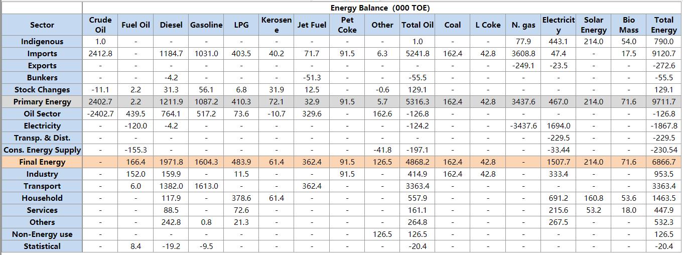
Task II: The Ministry publishes the national energy balance annually showing the primary energy supply and the final energy consumption. Your supervisor complains that it is usually difficult to explain the energy balance to politicians and decision-makers. You suggest that it is possible to visualize the data in the form of a Sankey diagram. Your supervisor asked you to show the changes in energy utilization in Jordan (primary, conversion, final) between 2008 and 2018 through Sankey diagrams based on the data compiled by the Ministry. Information can be accessed via the attached table in the other image. Where you must enter this data on the Sankei chart and the code that was worked on in order to create this chart must be shown. Submit your work in the form of an A3 poster that contains two Sankey diagrams one for each year. Suggested resource: https://developers.google.com/chart/interactive/docs/gallery/sankey
Step by Step Solution
3.31 Rating (169 Votes )
There are 3 Steps involved in it
To create a Sankey diagram for the energy balance data you can use the Google Charts library Heres a stepbystep guide on how to approach this task Ste... View full answer

Get step-by-step solutions from verified subject matter experts