

Question: Hello please help me resolve this question : fffCreate a frequency chart (also known as the frequency distribution or the histogram) for the data. Does
Hello please help me resolve this question :
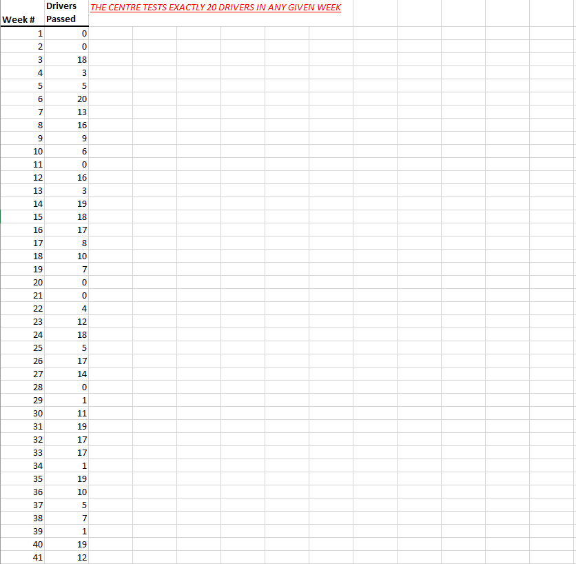
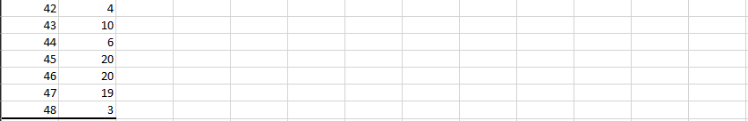
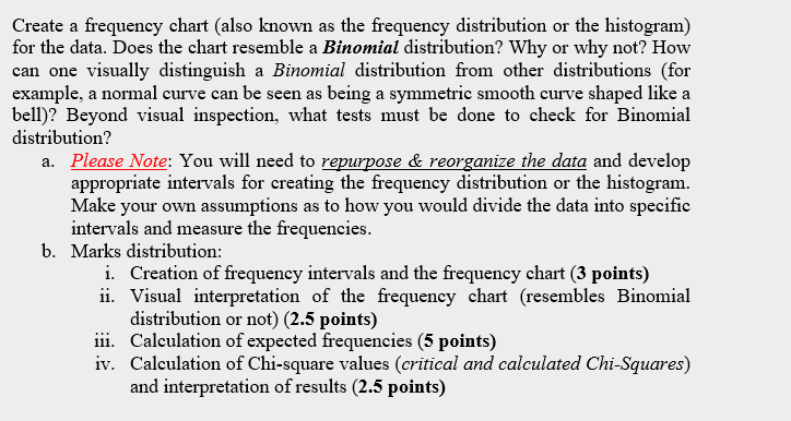
\f\f\fCreate a frequency chart (also known as the frequency distribution or the histogram) for the data. Does the chart resemble a Binomial distribution? Why or why not? How can one visually distinguish a Binomial distribution from other distributions (for example, a normal curve can be seen as being a symmetric smooth curve shaped like a bell)? Beyond visual inspection, what tests must be done to check for Binomial distribution? a. Please Note: You will need to repurpose & reorganize the data and develop appropriate intervals for creating the frequency distribution or the histogram. Make your own assumptions as to how you would divide the data into specific intervals and measure the frequencies. b. Marks distribution: i. Creation of frequency intervals and the frequency chart (3 points) ii. Visual interpretation of the frequency chart (resembles Binomial distribution or not) (2.5 points) 11i. Calculation of expected frequencies (5 points) iv. Calculation of Chi-square values (critical and calculated Chi-Squares) and interpretation of results (2.5 points)
Step by Step Solution
There are 3 Steps involved in it

Get step-by-step solutions from verified subject matter experts