

Question: help me to do it in excel step by step 3: Analyzing Data with Pie Charts, Line Charts, and What-If Ana... 2021 Employment 2020 Employment
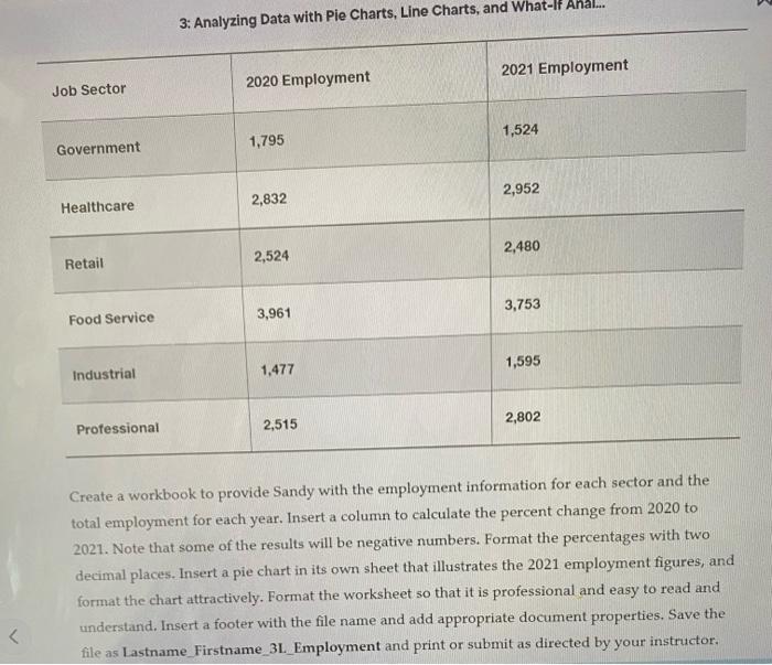
3: Analyzing Data with Pie Charts, Line Charts, and What-If Ana... 2021 Employment 2020 Employment Job Sector 1,524 Government 1,795 2,952 2,832 Healthcare 2,480 Retail 2,524 3,753 Food Service 3,961 1,595 Industrial 1,477 Professional 2,515 2,802 Create a workbook to provide Sandy with the employment information for each sector and the total employment for each year. Insert a column to calculate the percent change from 2020 to 2021. Note that some of the results will be negative numbers. Format the percentages with two decimal places. Insert a pie chart in its own sheet that illustrates the 2021 employment figures, and format the chart attractively. Format the worksheet so that it is professional and easy to read and understand. Insert a footer with the file name and add appropriate document properties. Save the file as Lastname_Firstname_3L_Employment and print or submit as directed by your instructor,
Step by Step Solution
There are 3 Steps involved in it

Get step-by-step solutions from verified subject matter experts