

Question: Here are three different visualizations that show the same information. All three are showing how much energy five states use. Two also show more states,
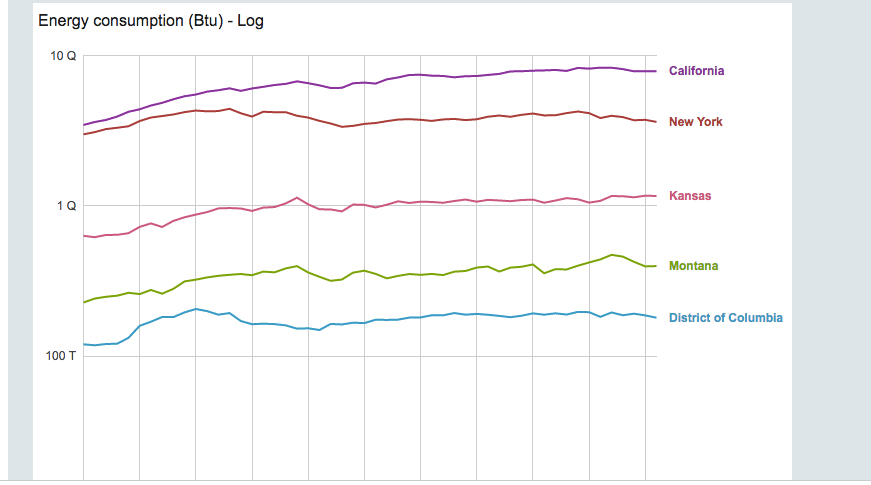
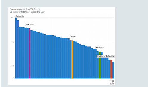
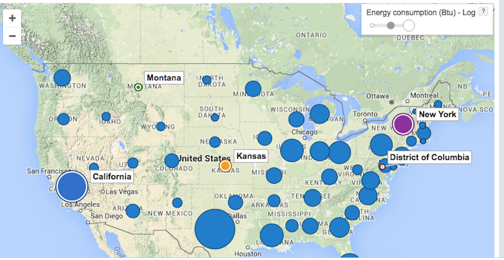
Here are three different visualizations that show the same information. All three are showing how much energy five states use. Two also show more states, but the same five states are highlighted. The five states are California, Montana, Kansas, New York, and the District of Columbia.
The map and bar graph show the totals for 2011. The line graph shows the totals from 1960 - 2011.
Which visualization would be the most useful to compare the amount of energy used by each of the five states in a single year? Why?
Which visualization would be the most useful to compare the five states' energy consumption over a range of years? Why?
Which visualization would be the most useful if you wanted to see a particular region of the USA?
What things do you think each of the graphs explains very clearly? What are some things that each graphs doesn't explain very well?snip
Step by Step Solution
There are 3 Steps involved in it

Get step-by-step solutions from verified subject matter experts