

Question: Homework 3 DA 6233 Homework (https://rpubs.com/malshe/homework3) R Coding Q2 (3 points) For this visualization you will use plot_ly() function. There is only one more function

Homework 3
DA 6233
Homework (https://rpubs.com/malshe/homework3)
R Coding
Q2 (3 points)
For this visualization you will use plot_ly() function. There is only one more function in the plot: layout(). This function allows you to set the title of the plot as well as axes titles. You will use it only for changing the titles and nothing else. To produce this plot, we will use economics data set from ggplot2.
Hint: Download Plotly cheatsheet
Produce the following plot:
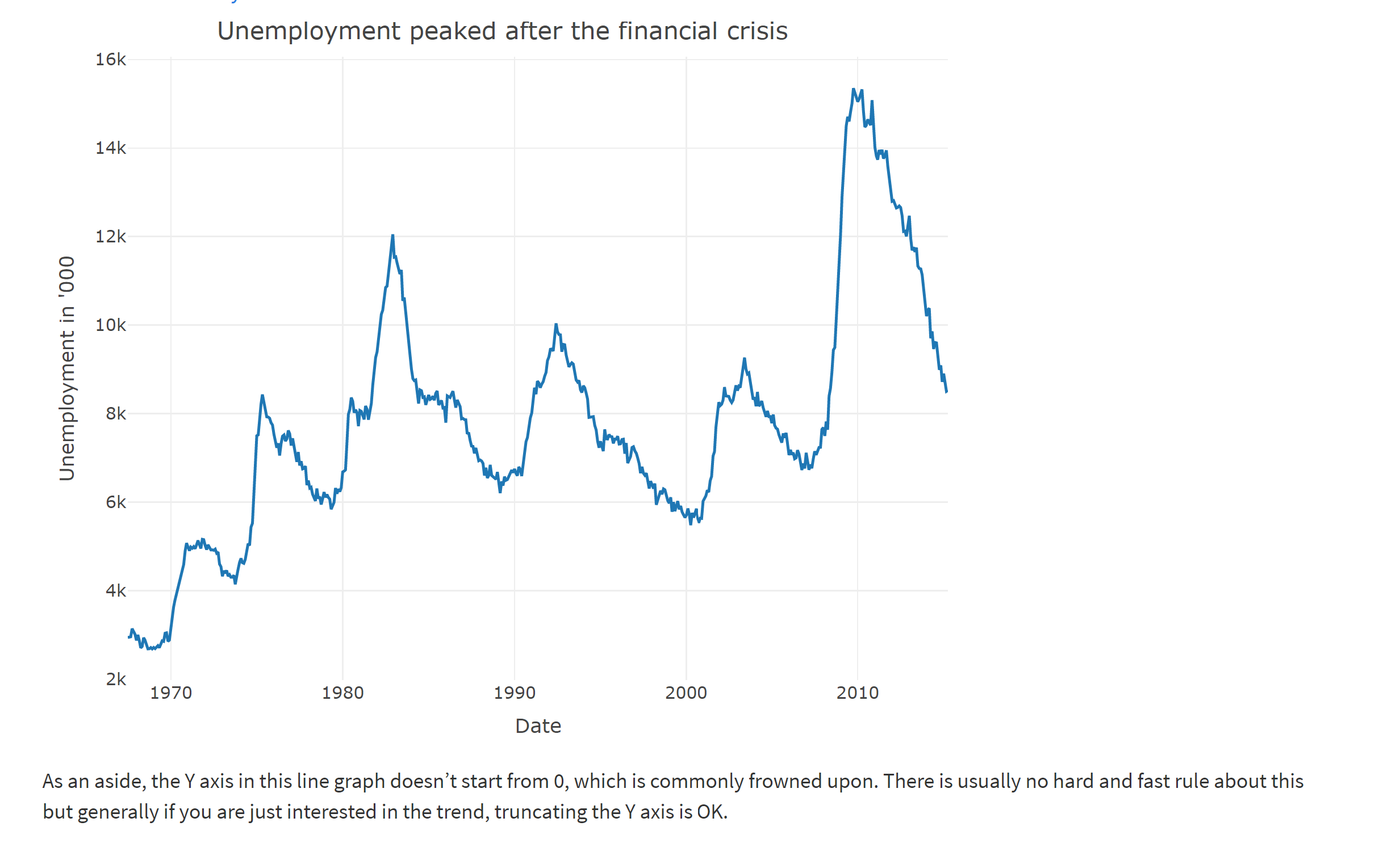
Unemployment peaked after the financial crisis 16k 14k 12k 10k Unemployment in '000 8k 6k 4k 2k 1970 1980 1990 2000 2010 Date As an aside, the Y axis in this line graph doesn't start from 0, which is commonly frowned upon. There is usually no hard and fast rule about this but generally if you are just interested in the trend, truncating the Y axis is OK
Step by Step Solution
There are 3 Steps involved in it

Get step-by-step solutions from verified subject matter experts