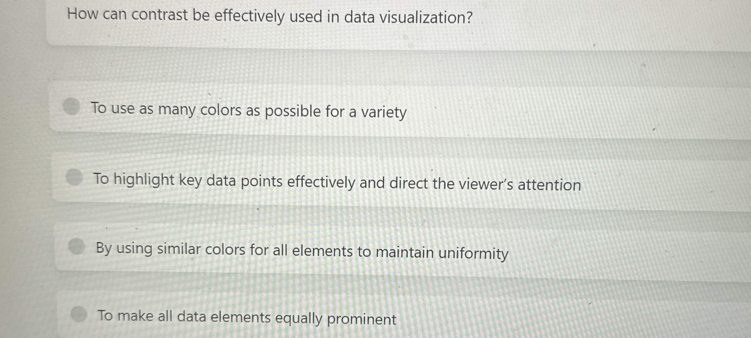
Question: How can contrast be effectively used in data visualization? To use as many colors as possible for a variety To highlight key data points effectively
How can contrast be effectively used in data visualization?
To use as many colors as possible for a variety
To highlight key data points effectively and direct the viewer's attention
By using similar colors for all elements to maintain uniformity
To make all data elements equally prominent

Step by Step Solution
There are 3 Steps involved in it
1 Expert Approved Answer
Step: 1 Unlock


Question Has Been Solved by an Expert!
Get step-by-step solutions from verified subject matter experts
Step: 2 Unlock
Step: 3 Unlock


