

Question: How do I get a scatterplot like this with my own data? Heres what I have so far: species setosa versicolor virginica . sepal_length sepal_width
How do I get a scatterplot like this with my own data?
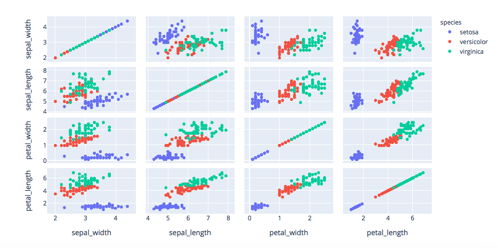
Heres what I have so far:
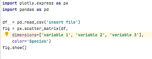
species setosa versicolor virginica . sepal_length sepal_width petal_length petal_width 5 6 7 8 0 2 2 4 6 sepal_width sepal_length petal_width petal_length import plotly.express as px import pandas as pd df = pd. read_csv('insert file') fig = px.scatter_matrix(df, dimensions=['variable 1', 'variable 2', 'variable 3'], color='Species') fig.show()
Step by Step Solution
There are 3 Steps involved in it
1 Expert Approved Answer
Step: 1 Unlock

Question Has Been Solved by an Expert!
Get step-by-step solutions from verified subject matter experts
Step: 2 Unlock
Step: 3 Unlock