

Question: html and css An element in a web page has the following styling: width: 80%; min-width: 780px; max-width: 1200px; how will that element be displayed
html and css 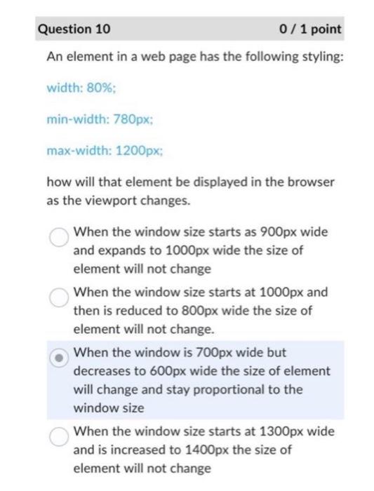
An element in a web page has the following styling: width: 80%; min-width: 780px; max-width: 1200px; how will that element be displayed in the browser as the viewport changes. When the window size starts as 900px wide and expands to 1000px wide the size of element will not change When the window size starts at 1000px and then is reduced to 800px wide the size of element will not change. When the window is 700px wide but decreases to 600px wide the size of element will change and stay proportional to the window size When the window size starts at 1300px wide and is increased to 1400px the size of element will not change
Step by Step Solution
There are 3 Steps involved in it
1 Expert Approved Answer
Step: 1 Unlock

Question Has Been Solved by an Expert!
Get step-by-step solutions from verified subject matter experts
Step: 2 Unlock
Step: 3 Unlock
 Study Help