

Question: HTML and CSS to build a website. The image: The style guide can be found here: Font-family : Roboto (Google Font) #F2F2F2 :Header background-color #20a8b4:
HTML and CSS to build a website.
The image:
The style guide can be found here:
Font-family: Roboto (Google Font)
-
-
#F2F2F2 :Header background-color
-
-
-
#20a8b4: Button background-color &Learn to text color
-
-
-
#ff5c0f:Navigation-link hover text color, Button hover background-color,Code text color,learning to code? text color
-
-
-
Colors that look white are #fff and colors that look black are #000
-
BUILDING A WEBSITE
Task: Using the assets provided to you, build a website that is identical to the designs provided. Make sure to include media queries for altering the layout to account for mobile or desktop users.
Build Specifications:
The website must be mobile responsive. This means the page must match the stacked layout on mobile, and the inline layout on desktop. You need to be using flex box to achieve this.
All of the colors provided in the style guide must be used correctly.
There should be the correct hover state applied to the buttons and the navigation links.
An image must be implemented but should only show on desktop, not mobile.
Use the correct font given in the style guide.
All buttons should be 100% width on mobile and go to auto width on desktop.
Media queries must be written correctly - changing styles at 768px,mobile-first, only using the min-width property.
The stylesheet must be linked correctly, as well as have the meta viewport tag.
Anchor tags should not have an underline.
-Navigation is created by using a .
-Meta viewport tag is properly built into HTML
Rubric:
1.Website is mobile-responsive, matching the stacked layout on mobile, and the inline layout on desktop, using flexbox. 2.Media queries must be written correctly - changing styles at 768px,mobile-first, only using the min-width property.
3.Website uses all the colors provided in the style guide.
4.Website has the correct hover state on the buttons and the navigation links.
5.Image shows on desktop but not mobile.
6.Website uses the correct font given in the style guide, linked from Google fonts. (Roboto)
7.Buttons are 100% width on mobile and go to auto width on desktop.
8.Links are not be underlined.
9.Navigation is created by using a .
10.Meta viewport tag is properly built into HTML.
End Results: Desktop and mobile view
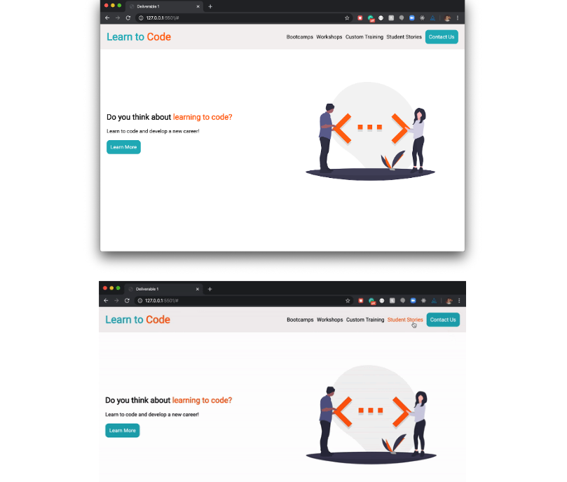
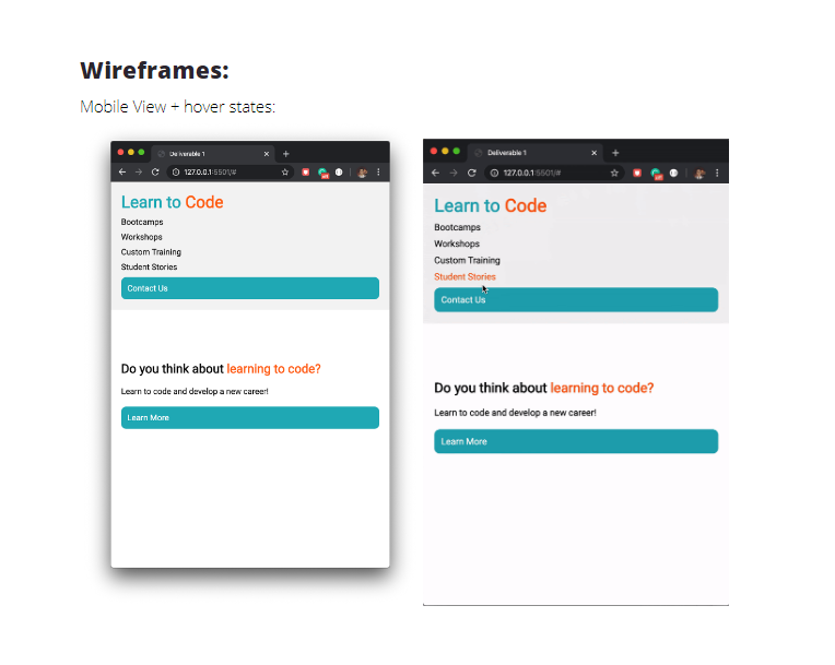
Dell1 127.0.0.15604 Learn to Code Bootcamps Workshops Custom Training Student Stories Contact Us Do you think about learning to code? Learn to code and develop a new career! Learn More Deliverable 1 127.0.0.15504 Learn to Code Bootcamps Workshops Custom Training Student Stories Contact Us Do you think about learning to code? Leam to code and develop a new career Learn More Wireframes: Mobile view + hover states: Deliverable 1 Davere1 CO 127.0.0.1:550 127.0.0.1 550 Learn to Code Learn to Code Bootcamps Workshops Custom Training Student Stories Bootcamps Workshops Custom Training Student Stories Contact Us Contact Us Do you think about learning to code? Learn to code and develop a new careert Learn More Do you think about learning to code? Learn to code and develop a new career! Learn More
Step by Step Solution
There are 3 Steps involved in it

Get step-by-step solutions from verified subject matter experts
 Study Help