

Question: https://www.dropbox.com/s/7k72tszjp3yf2n2/Assignment%205.zip?dl=0 Open the Assignment 5.html in a browser , the document will look like the image below. Now open the Assignment 5.html in a text
https://www.dropbox.com/s/7k72tszjp3yf2n2/Assignment%205.zip?dl=0
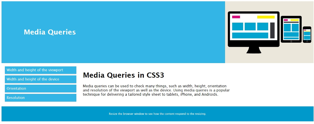
Open the Assignment 5.html in a browser , the document will look like the image below.
Now open the Assignment 5.html in a text editor ( Notepad or EditPad Lite)
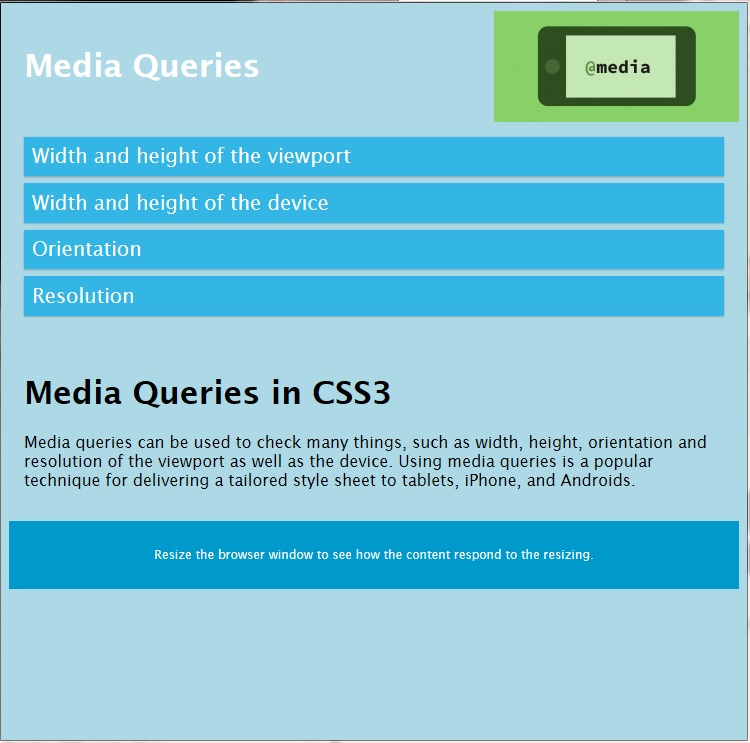
Add @media rule that does the following when the viewport is less than 800px.
change the background color to lightblue
change the div elements col-1 and col 2 to have the width of 100%
Change the listed items to have the font size of 20, font style of italic
change the image to css-media-query.jpg
After the modifications your html document would look like this when the viewport is less than 800px.
Media Queries Width and height of the viewport Width and height of the device Orientation Resolution Media Queries in CSS3 Media queries can be used to check many things, such as width, height, orientation and resolution of the viewport as well as the device. Using media queries is a popular technique for delivering a tailored style sheet to tablets, iPhone, and Androids. Resize the browser window to see how the content respond to the resizing
Step by Step Solution
There are 3 Steps involved in it

Get step-by-step solutions from verified subject matter experts
 Study Help