

Question: I Am In Intro to Web Interface Develop. We Use HTML And I Need Help With This Assingment. We Are working on More Advance Layout
I Am In Intro to Web Interface Develop. We Use HTML And I Need Help With This Assingment. We Are working on More Advance Layout And Styling Features And I dont care what you put for the create your own part. The Website link is https://ccuresearch.coastal.edu/jlsmit31/csci120/chapter4/project/locations.html
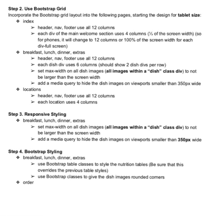
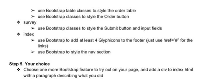
Step 2. Use Bootstrap Grid Incorporate the Bootstrap grid layout into the following pages, starting the design for tablet size index header, nav, footer use all 12 columns each div of the main welcome section uses 4 columns (% of the screen width) (so for phones, it will change to 12 columns or 100% of the screen width for each div-full screen) breakfast, lunch, dinner, extras header, nav, footer use all 12 columns each dish div uses 6 columns (should show 2 dish divs per row) set max-width on all dish images (all images within a "dish" class div) to not be larger than the screen width add a media query to hide the dish images on viewports smaller than 350px wide locations header, nav, footer use all 12 columns each location uses 4 columns Step 3. Responsive Styling * breakfast, lunch, dinner, extras set max-width on all dish images (all images within a "dish" class div) to not be larger than the screen width add a media query to hide the dish images on viewports smaller than 350px wide Step 4. Bootstrap Styling breakfast, lunch, dinner, extras use Bootstrap table classes to style the nutrition tables (Be sure that this overrides the previous table styles) use Bootstrap classes to give the dish images rounded comers order Step 2. Use Bootstrap Grid Incorporate the Bootstrap grid layout into the following pages, starting the design for tablet size index header, nav, footer use all 12 columns each div of the main welcome section uses 4 columns (% of the screen width) (so for phones, it will change to 12 columns or 100% of the screen width for each div-full screen) breakfast, lunch, dinner, extras header, nav, footer use all 12 columns each dish div uses 6 columns (should show 2 dish divs per row) set max-width on all dish images (all images within a "dish" class div) to not be larger than the screen width add a media query to hide the dish images on viewports smaller than 350px wide locations header, nav, footer use all 12 columns each location uses 4 columns Step 3. Responsive Styling * breakfast, lunch, dinner, extras set max-width on all dish images (all images within a "dish" class div) to not be larger than the screen width add a media query to hide the dish images on viewports smaller than 350px wide Step 4. Bootstrap Styling breakfast, lunch, dinner, extras use Bootstrap table classes to style the nutrition tables (Be sure that this overrides the previous table styles) use Bootstrap classes to give the dish images rounded comers order
Step by Step Solution
There are 3 Steps involved in it

Get step-by-step solutions from verified subject matter experts
 Study Help