

Question: I need assitance The graph to the right compares teaching salaries of women Salaries ($) and men at private colleges and universities. What impression 80000-
I need assitance
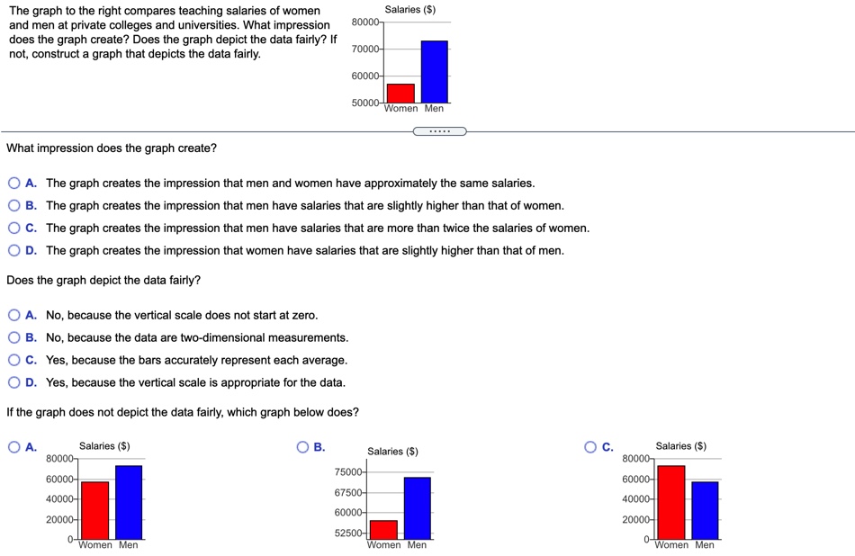
The graph to the right compares teaching salaries of women Salaries ($) and men at private colleges and universities. What impression 80000- does the graph create? Does the graph depict the data fairly? If 70000- not, construct a graph that depicts the data fairly. 60000- 50000- Women Men What impression does the graph create? O A. The graph creates the impression that men and women have approximately the same salaries. O B. The graph creates the impression that men have salaries that are slightly higher than that of women. O C. The graph creates the impression that men have salaries that are more than twice the salaries of women. O D. The graph creates the impression that women have salaries that are slightly higher than that of men. Does the graph depict the data fairly? O A. No, because the vertical scale does not start at zero. O B. No, because the data are two-dimensional measurements. O C. Yes, because the bars accurately represent each average. O D. Yes, because the vertical scale is appropriate for the data. If the graph does not depict the data fairly, which graph below does? O A. Salaries ($) OB. O C. Salaries ($) Salaries ($) 80000 80000 75000- 60000- 60000- 67500 40000- 40000- 60000- 20000- 20000- 52500- 0- Women Men Women Men -Women Men
Step by Step Solution
There are 3 Steps involved in it

Get step-by-step solutions from verified subject matter experts