

Question: i need help finishing this page please. my graph for neon is the best graph as its closer to R^1. i just need help on
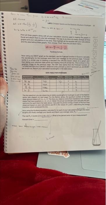
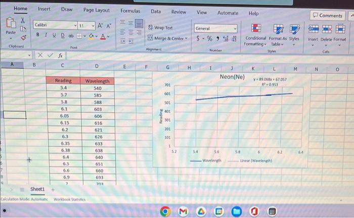
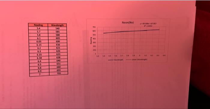
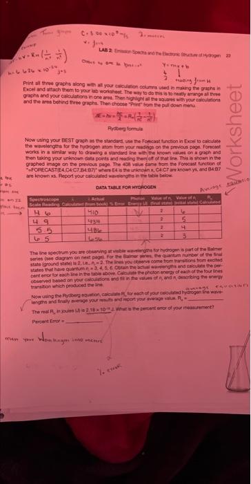
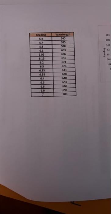
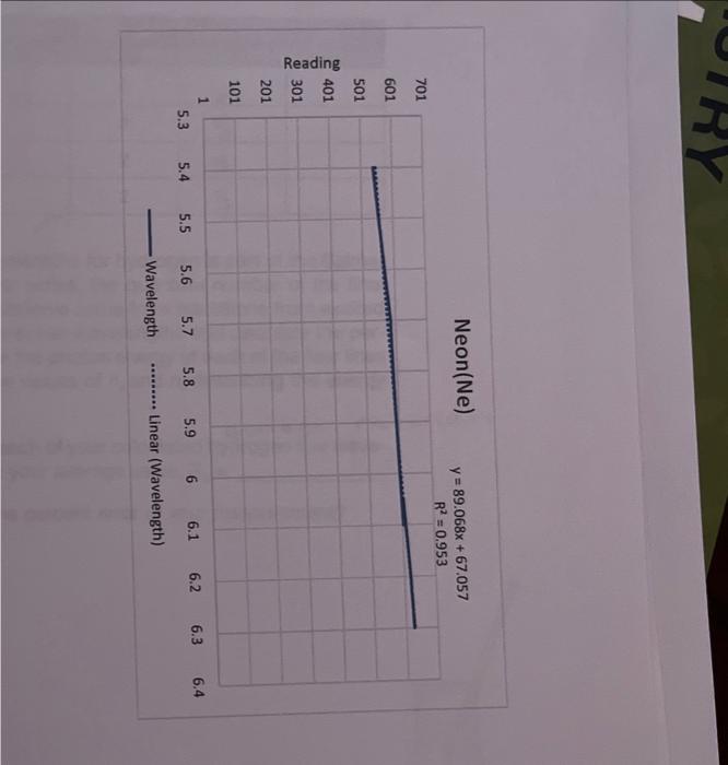
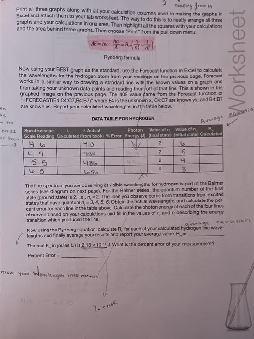
ModeAviomisicWoritookSurivicesheet1 \begin{tabular}{|c|c|} \hline Readiag & Wrvelength \\ \hline 5.4 & 540 \\ \hline 5.7 & 5.55 \\ \hline 5.8 & 589 \\ \hline 6.1 & 603 \\ \hline 6.05 & 606 \\ \hline 6.15 & 616 \\ \hline 6.2 & 621 \\ \hline 6.3 & 626 \\ \hline 6.35 & 633 \\ \hline 6.38 & 638 \\ \hline 6.4 & 640 \\ \hline 6.5 & 651 \\ \hline 6.6 & 660 \\ \hline 6.9 & 693 \\ \hline 7 & 703 \\ \hline \end{tabular} Neon(Ne) y=89.068x+67.057 Wavelength Linear (Wavelength) Print all three graphs along with all your calculation columns used in making the graphs in Excel and attach them to your lab worksheet. The way to do this is to neatly arrange all three graphs and your calculations in one area. Then highlight all the squares with your calculations and the area behind three graphs. Then choose "Print" from the pull down menu. AE=hv=hc=RH(n21n21) Rydberg formula Now using your BEST graph as the standard, use the Forecast function in Excel to calculate the wavelengths for the hydrogen atom from your readings on the previous page. Forecast works in a similar way to drawing a standard line with the known values on a graph and then taking your unknown data points and reading them off of that line. This is shown in the graphed image on the previous page. The 408 value came from the Forecast function of "=FORECAST(E4,C4:C7,B4:B7)" where E4 is the unknown x,C4:C7 are known ys, and B4:B7 are known x. Report your calculated wavelengths in the table below. DATA TABLE FOR HYDROGEN The line spectrum you are observing at visible wavelengths for hydrogen is part of the Balmer series (see diagram on next page). For the Balmer series, the quantum number of the final state (ground state) is 2, 1.e.n nc=2. The lines you observe come from transitions from excited states that have quantum n=3,4,5,6. Obtain the actual wavelengths and calculate the percent error for each line in the table above. Calculate the photon energy of each of the four lines observed based on your calculations and fill in the values of nr and n, describing the energy. transition which produced the line
Step by Step Solution
There are 3 Steps involved in it

Get step-by-step solutions from verified subject matter experts