

Question: I need help on approaching the questions, after the graph (the graph is also attached) Draw a new graph that shows the Marginal Cost (MC)
I need help on approaching the questions, after the graph (the graph is also attached)
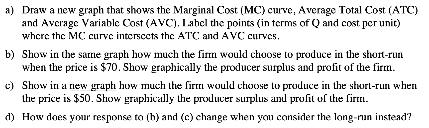
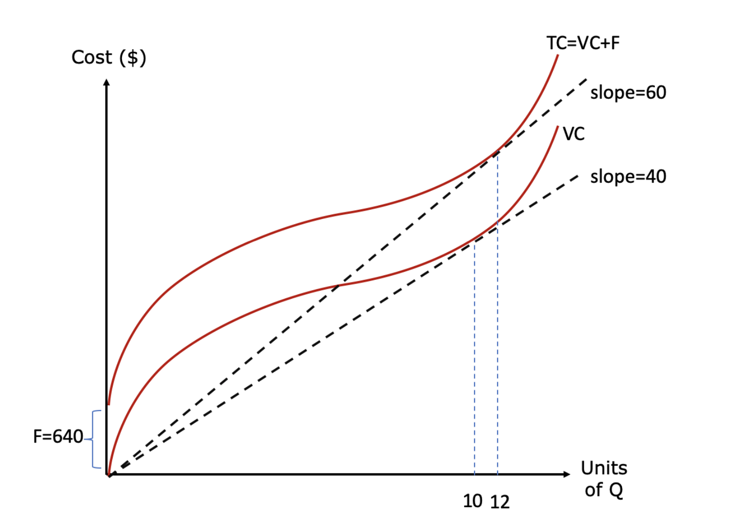
Draw a new graph that shows the Marginal Cost (MC) curve, Average Total Cost (ATC) and Average Variable Cost (AVC). Label the points (in terms of Q and cost per unit) where the MC curve intersects the ATC and AVC curves. Show in the same graph how much the rm would choose to produce in the shortrun when the price is $70. Show graphically the producer surplus and prot of the rm. Show in a new graph how much the rm would choose to produce in the shortrun when the price is $50. Show graphically the producer surplus and prot of the rm. How does your response to (b) and (c) change when you consider the long-run instead? \f
Step by Step Solution
There are 3 Steps involved in it

Get step-by-step solutions from verified subject matter experts