

Question: i want answer for first 3 parts U) Create a Clustered Column Chart on a new Sheet (use Excel's features for a New Chart sheet)
i want answer for first 3 parts
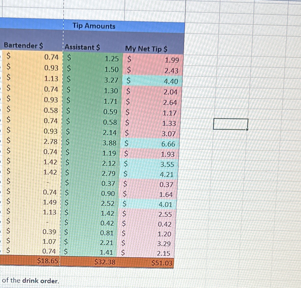
U) Create a Clustered Column Chart on a new Sheet (use Excel's features for a New Chart sheet) that compares the bartender tips, the assistant tips to your net tip for all 20 customers. Name the worksheet, \"Tips Comparison\". Use combo chart option to show my net tip average (10 marks) (14 marks) V) Change the Chart title, "Tips Chart\" and add a Legend at the top of the chart. Show the data labels as you see fit for each of tl'lhsbartender, assistant, and you (3 marks) W) Add a vertical or horizontal axis label. It should read \"Tips\". (2 marks) X) Create a 3Dclustered column chart on a new sheet only using the totals of columns G, H and l and add Chart title "'3'ips Chart" (10 marks). Tip Amounts Bartender $ Assistant $ My Net Tip $ 0.74 1.25 S 1.99 0.93 S 1.50 S 2.43 1.13 $ 3.27 S 4.40 0.74 1.30 2.04 0.93 1.71 S 2.64 0.58 S 0.59 1.17 0.74 S 0.58 1.33 0.93 S 2.14 3.07 2.78 3.88 6.66 0.74 1.19 S 1.93 1.42 2.12 S 3.55 1.42 2.79 S 4.21 0.37 $ 0.37 0.74 0.90 S 1.64 1.49 2.52 4.01 1.13 1.42 2.55 0.42 0.42 0.39 0.81 1.20 1.07 2.21 S 3.29 0.74 1.41 2.15 $18.65 $32.38 $51.03 of the drink order
Step by Step Solution
There are 3 Steps involved in it

Get step-by-step solutions from verified subject matter experts