

Question: Implement the chart visualization code. Specifically, complete generateAPTVis ( . . . ) as described. Given a dataframe, and the augmented ordering ( we '
Implement the chart visualization code. Specifically, complete generateAPTVis as described. Given a dataframe, and the "augmented" ordering well use selectEncodings to do this return an Altair chart using the specified encodings. You may implement additional additional "helper" functions if needed. def generateAPTVisvarbsindf, hasEncodingsFalse:input: indf the dataframe to encode. The assumption is that variables in varbsinput: hasEncodings if the varbs data already has the encoding column useful for testingwe assume each element in varbs already has an 'encoding' keyexceptions: EncodingException if there is an encoding failureif not hasEncodings:
varbs selectEncodingsvarbstoRet alt.Chartindfreturn toRet order variable:q"type":"Q
variable:q"type":"Q
variable:o"type":"
displayselectEncodingsorder
generateAPTVisordertestingFrame
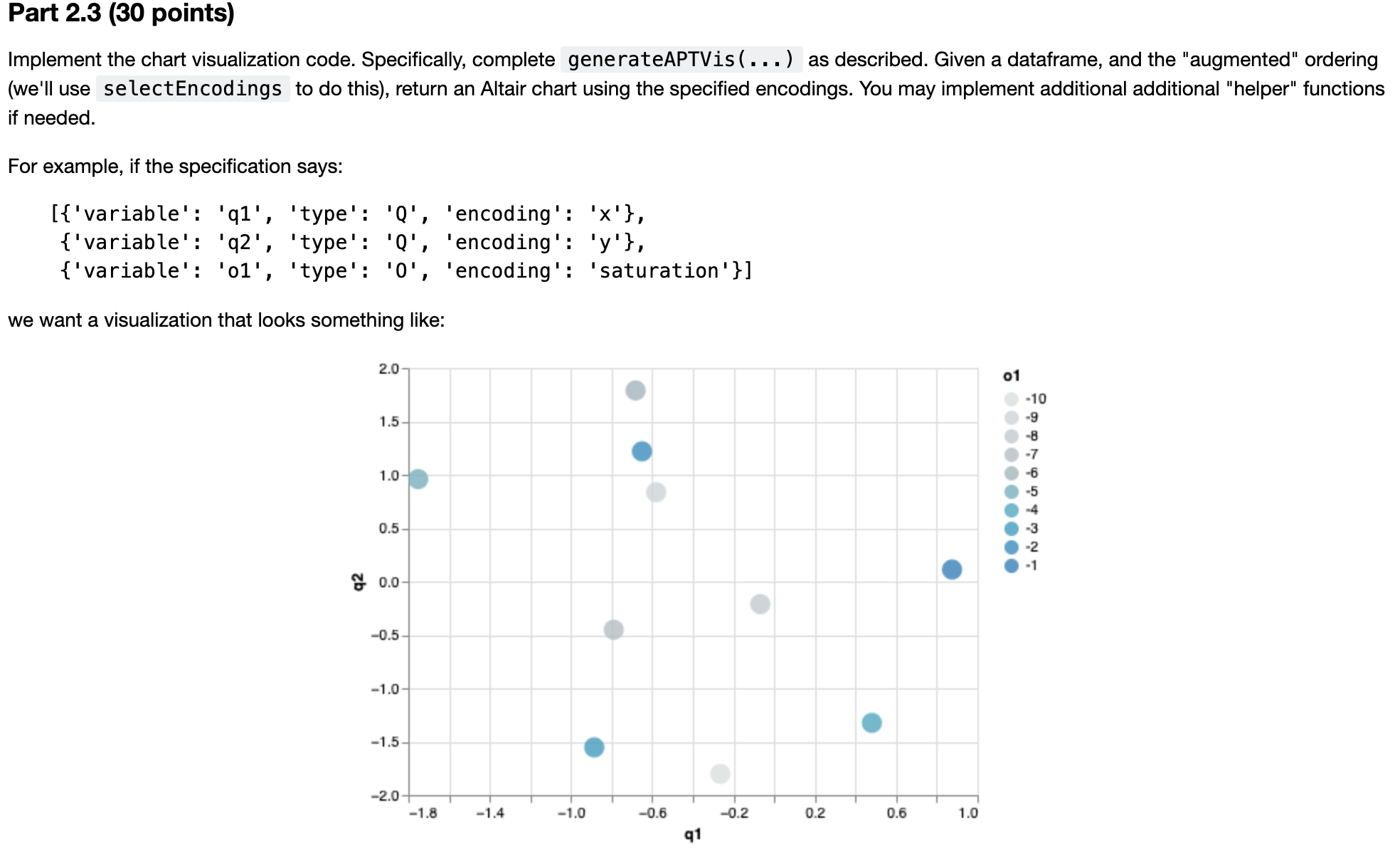
For example, if the specification says:
variable: q 'type': Q 'encoding': x
variable: q 'type': Q 'encoding': y
variable: o 'type': O 'encoding': 'saturation'
we want a visualization that looks something like:
Part points
Implement the chart visualization code. Specifically, complete generateAPTVis as described. Given a dataframe, and the "augmented" ordering
well use selectEncodings to do this return an Altair chart using the specified encodings. You may implement additional additional "helper" functions
if needed.
For example, if the specification says:
: 'type': 'encoding':
: 'type': 'encoding':
: 'type': 'encoding': 'saturation'
we want a visualization that looks something like:
Hints
You might want to find a way of creating Altair visualizations using loops see how to "extend" charts in Part above
For colors, we recommend looking at the documentation for alt.Scale.
If you're not using "area" you might find that the points are quite small. We suggest hard coding a larger value so the points are visible.
Points are not filled, you might want to fill them so they are easier to read
def generateAPTVisvarbsindf,hasEncodingsFalse:
# input: varbs the variables we want to encode in the format describe above
# input: indf the dataframe to encode. The assumption is that variables in varbs
# map to columns in indf
# input: hasEncodings if the varbs data already has the encoding column useful for testing
# default is False, in which case we will call selectEncodings, if true
# we assume each element in varbs already has an 'encoding' key
# return: an approriate Altair vis
# exceptions: EncodingException if there is an encoding failure
# find the encodings
if not hasEncodings:
varbs selectEncodingsvarbs
# modify the following code as needed
toRet alt.Chartindf
# YOUR CODE HERE
return toRet
# here's a sample test. You should expand on this to make sure your function works more generally
order variable:q"type":"Q
variable:q"type":"Q
variable:o"type":"O
displayselectEncodingsorder
generateAPTVisordertestingFrame
Step by Step Solution
There are 3 Steps involved in it
1 Expert Approved Answer
Step: 1 Unlock

Question Has Been Solved by an Expert!
Get step-by-step solutions from verified subject matter experts
Step: 2 Unlock
Step: 3 Unlock