Question: In addition to the information provided on the data dashboard included in the chartfile, Espl ndido Jugo y Batido management has decided it would like
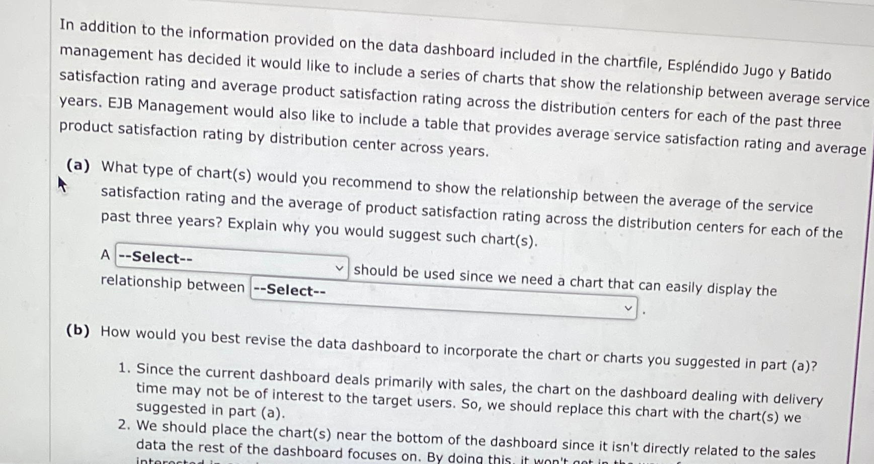
In addition to the information provided on the data dashboard included in the chartfile, Esplndido Jugo Batido management has decided it would like to include a series of charts that show the relationship between average service satisfaction rating and average product satisfaction rating across the distribution centers for each of the past three years. EJB Management would also like to include a table that provides average service satisfaction rating and average product satisfaction rating by distribution center across years.
a What type of charts would you recommend to show the relationship between the average of the service satisfaction rating and the average of product satisfaction rating across the distribution centers for each of the past three years? Explain why you would suggest such charts
A relationship betwe should be used since we need a chort thsily display the
b How would you best revise the data dashboard to incorporate the chart or charts you suggested in part a
Since the current dashboard deals primarily with sales, the chart on the dashboard dealing with delivery time may not be of interest to the target users. So we should replace this chart with the charts we suggested in part a
We should place the charts near the bottom of the dashboard since it isn't directly related to the sales data the rest of the dashboard focuses on By doing this it wh'te isn't directly related to the sales

Step by Step Solution
There are 3 Steps involved in it
1 Expert Approved Answer
Step: 1 Unlock


Question Has Been Solved by an Expert!
Get step-by-step solutions from verified subject matter experts
Step: 2 Unlock
Step: 3 Unlock


