

Question: It's time to create your presentation to stakeholders. It will include a data visualization that demonstrates the trend of people being less likely to
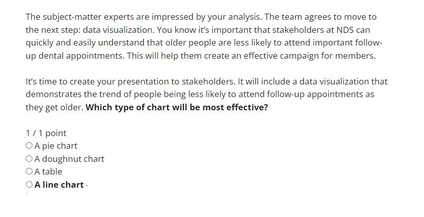
It's time to create your presentation to stakeholders. It will include a data visualization that demonstrates the trend of people being less likely to attend follow-up appointments as they get older. Which type of chart will be most effective? The subject-matter experts are impressed by your analysis. The team agrees to move to the next step: data visualization. You know it's important that stakeholders at NDS can quickly and easily understand that older people are less likely to attend important follow- up dental appointments. This will help them create an effective campaign for members. It's time to create your presentation to stakeholders. It will include a data visualization that demonstrates the trend of people being less likely to attend follow-up appointments as they get older. Which type of chart will be most effective? 1/1 point OA pie chart A doughnut chart OA table OA line chart
Step by Step Solution
There are 3 Steps involved in it
A line chart would be the most effective type of char... View full answer

Get step-by-step solutions from verified subject matter experts