

Question: library(ggplot2) df N x.grid data x = c(x.grid, x.grid), y = c(dnorm(x.grid), dt(x.grid, df)), type = c( rep('Normal',N), rep('T',N) ) ) # make a nice
library(ggplot2)
df
N
x.grid
data
Std Normal vs t with 5 degrees of freedom a. Use a loop to create similar graphs for degrees of freedom 2,3,4,,29,30. b. In retrospect, perhaps we didn't need to produce all of those. Rewrite your loop so that we only produce graphs for {2,3,4,5,10,15,20,25,30} degrees of freedom. Hint: you can just modify the vector in the for statement to include the desired degrees of freedom x = c(x.grid, x.grid),
y = c(dnorm(x.grid), dt(x.grid, df)),
type = c( rep('Normal',N), rep('T',N) ) )
# make a nice graph
myplot 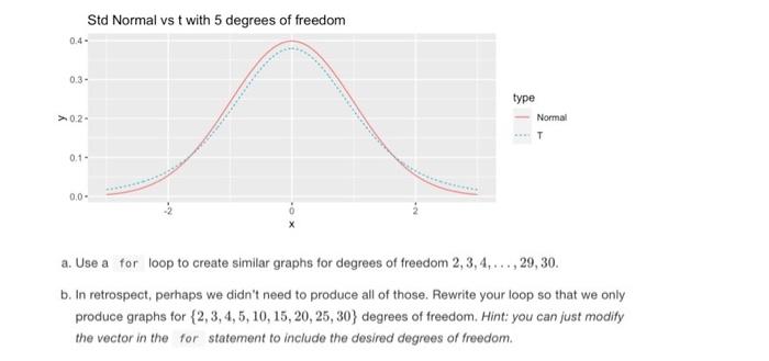
geom_line() +
labs(title = paste('Std Normal vs t with', df, 'degrees of freedom'))
# actually print the nice graph we made
print(myplot)
Step by Step Solution
There are 3 Steps involved in it
1 Expert Approved Answer
Step: 1 Unlock

Question Has Been Solved by an Expert!
Get step-by-step solutions from verified subject matter experts
Step: 2 Unlock
Step: 3 Unlock