

Question: Materials ACTIVITY 1 Needed but not supplied: - Graphing Software (Excel, Open Office , etc.) A Graphing by Hand - Printer to print graphing paper
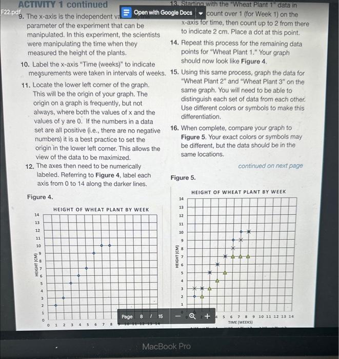
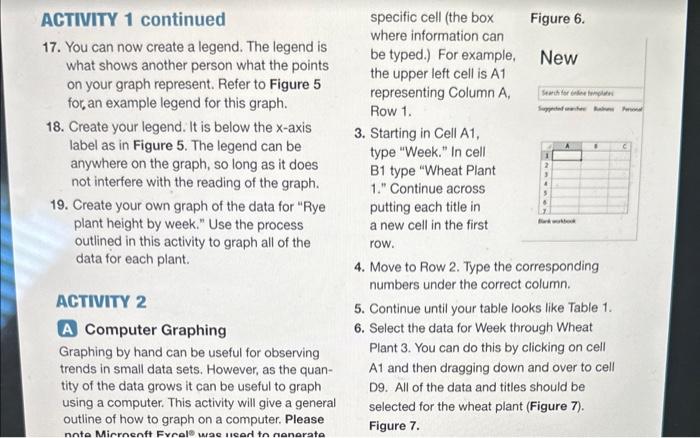
Materials ACTIVITY 1 Needed but not supplied: - Graphing Software (Excel, Open Office , etc.) A Graphing by Hand - Printer to print graphing paper A common method to look at data is to create an x,y scatter graph. In this first activity, you will Safety create two graphs of the data from Table 1. There are no safety concems for this lab 1. Print 2 copies of the graphing sheet found on activity. page 13. 2. Title the first graph "Wheat plant height by week." 3. Title the second graph "Rye plant height by week" and set aside for later. 4. At the bottom of the graph there is a space to label the x-axis. The x-axis runs from left to right, with smaller numbers starting on the left and the numbers increasing as you move to the right. 5. At the left of the graph there is a space to label the y-axis. The y-axis runs from the bottom to top of the graph, with smaller numbers starting at the bottom and the size of the numbers increasing as you move up. 6. You will now label each axis and decide which pieces of data will be our x-values and our y-values, respectively. 7. One method to determine which data should be your x versus y axis is to think about the goal of the experiment. The y-axis should be for data that you measured for, the dependent variable. In the data set in Table 1, the scientists were measuring the height each week. This means that the height is the dependent variable. 8. Label the y-axis "Height (cm)." It is important to always include the unit of measurement on the axis. In this case the unit is centimeters ABTWITY 1 continued 13. Startinowith the "Wheat Plant 1 " data in 9. The x-axis is the independent v : count over 1 (for Week 1) on the parameter of the experiment that can be x-axis for time, then count up to 2 from there manipulated. In this experiment, the scientists to indicate 2cm. Place a dot at this point. were manipulating the time when they 14. Repeat this process for the remaining data measured the height of the plants. points for "Wheat Plant 1." Your graph 10. Label the x-axis "Time (weeks)" to indicate should now look like Figure 4. meassurements were taken in intervals of weeks. 15. Using this same process, graph the data for 11. Locate the lower left comer of the graph. "Wheat Plant 2 " and "Wheat Plant 3 " on the This will be the origin of your graph. The same graph. You will need to be able to origin on a graph is frequently, but not distinguish each set of data from each other. always, where both the values of x and the Use different colors or symbols to make this values of y are 0 . If the numbers in a data differentiation. set are all positive (i.e., there are no negative 16. When complete, compare your graph to numbers) it is a best practice to set the Figure 5. Your exact colors or symbols may origin in the lower left corner. This allows the be different, but the data should be in the view of the data to be maximized. same locations. 12. The axes then need to be numerically continued on next page labeled. Referring to Figure 4, label each axis from 0 to 14 along the darker lines. Figure 5. Figure 4. ACTIVITY 1 continued specific cell (the box Figure 6. 17. You can now create a legend. The legend is where information can what shows another person what the points be typed.) For example, New on your graph represent. Refer to Figure 5 the upper left cell is A1 for, an example legend for this graph. representing Column A, Row 1. 18. Create your legend. It is below the x-axis label as in Figure 5. The legend can be 3. Starting in Cell A1, anywhere on the graph, so long as it does type "Week." In cell not interfere with the reading of the graph. B1 type "Wheat Plant 1." Continue across 19. Create your own graph of the data for "Rye putting each title in plant height by week." Use the process a new cell in the first outlined in this activity to graph all of the row. data for each plant. 4. Move to Row 2. Type the corresponding numbers under the correct column. ACTINIT 2 5. Continue until your table looks like Table 1. A Computer Graphing 6. Select the data for Week through Wheat Graphing by hand can be useful for observing Plant 3. You can do this by clicking on cell trends in small data sets. However, as the quanA1 and then dragging down and over to cell tityofthedatagrowsitcanbeusefultographD9.Allofthedataandtitlesshouldbe using a computer. This activity will give a general selected for the wheat plant (Figure 7). outline of how to graph on a computer. Please Figure 7
Step by Step Solution
There are 3 Steps involved in it

Get step-by-step solutions from verified subject matter experts