

Question: need help. thank u! 1. 2. 3. 4. 5. 6. Jamie was preparing a visualization to show the results of an analysis of sales trends.
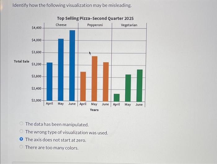
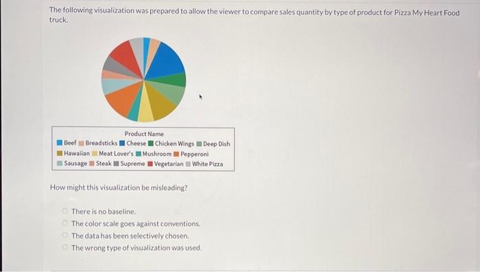
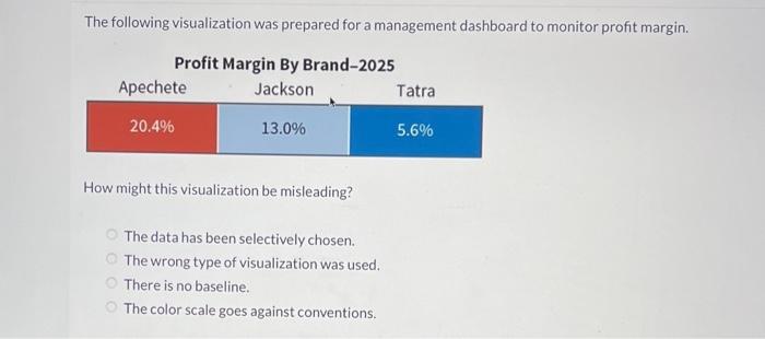
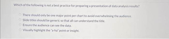
Jamie was preparing a visualization to show the results of an analysis of sales trends. Jamie has data for each month's sales from all the company's regions. All the sales data is reported in whole dollars except for the east region. The east region reports sales in thousands. This is an example of what type of data verification attribute? Accuracy Consistency Freshness Completeness If there are 9 categories in a column chart, which of the following would improve the visualization and make it easier for the reader to interpret? Using 9 different colors to differentiate the categories. Using horizontal bars. Using vertical bars. Using vertical labels to fit all the category descriptions in the graph. Identify how the following visualization may be misleading. The data has been manipulated. The wrong type of visualization was used. The axis does not start at zero. There are too many colors. The following visualization was prepared to allow the viewer to compare sales quantity by type of product for Pizza My Heart Food truck. How might this visualization be misleading? There is no baseline. The color scale goes against conventions: The data has been selectively chosen. The wrong type of visualization was used. The following visualization was prepared for a management dashboard to monitor profit margin. How might this visualization be misleading? The data has been selectively chosen. The wrong type of visualization was used. There is no baseline. The color scale goes against conventions. Which of the following is not a best practice for preparing a presentation of data analysis results? There should only be one major point per chart to avoid overwhelming the audience. Slide titles should be generic so that all can understand the title. Ensure the audience can see the data. Visually highlight the "a-ha" point or insight
Step by Step Solution
There are 3 Steps involved in it

Get step-by-step solutions from verified subject matter experts