

Question: need help with C only thanks Interpreting Graphical Data to Assess Investments The graphics below include data for all S&P 500 information-technology companies with positive
need help with C only thanks
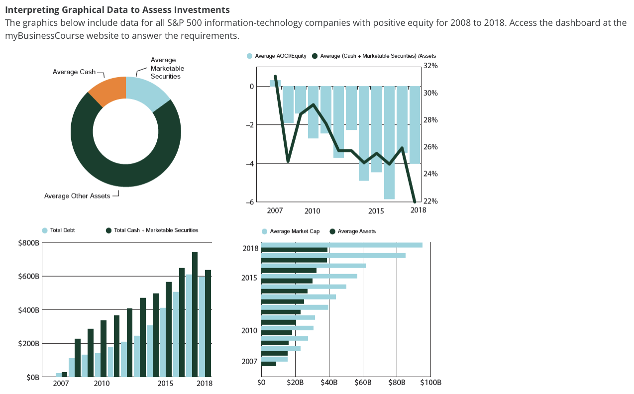
Interpreting Graphical Data to Assess Investments The graphics below include data for all S\&P 500 information-technology companies with positive equity for 2008 to 2018 . Access the dashboard at the myBusinessCourse website to answer the requirements. Required a. Consider the pie chart. What is included in the black portion of the graphic? In what year is the proportion of Cash the smallest? Hint: Interact with data in the dashboard to answer this question. b. The bar-line graphic (top right panel) reports the average AOCI as a proportion of equity, by year. Does the average firm have unrealized gains or losses across the 11 years? c. Consider the vertical bar chart that depicts total debt and total liquid assets (the aggregate for all the companies in the data set) (bottom left panel). In what year was the total debt outstanding at its peak? What amount of debt was outstanding? Note: Round to the nearest billion $x billion d. Consider the vertical bar chart (bottom left panel) and compare the aggregate total debt and total liquid assets. e. The horizontal bar graph (bottom right panel) plots total assets and market cap over time. What trend do we observe over time? Interpreting Graphical Data to Assess Investments The graphics below include data for all S\&P 500 information-technology companies with positive equity for 2008 to 2018 . Access the dashboard at the myBusinessCourse website to answer the requirements. Required a. Consider the pie chart. What is included in the black portion of the graphic? In what year is the proportion of Cash the smallest? Hint: Interact with data in the dashboard to answer this question. b. The bar-line graphic (top right panel) reports the average AOCI as a proportion of equity, by year. Does the average firm have unrealized gains or losses across the 11 years? c. Consider the vertical bar chart that depicts total debt and total liquid assets (the aggregate for all the companies in the data set) (bottom left panel). In what year was the total debt outstanding at its peak? What amount of debt was outstanding? Note: Round to the nearest billion $x billion d. Consider the vertical bar chart (bottom left panel) and compare the aggregate total debt and total liquid assets. e. The horizontal bar graph (bottom right panel) plots total assets and market cap over time. What trend do we observe over time
Step by Step Solution
There are 3 Steps involved in it

Get step-by-step solutions from verified subject matter experts