

Question: Objective 2 Interpret data displayed in tables and graphically. 2b. Create a frequency distribution and histogram from a data set. You must create this by
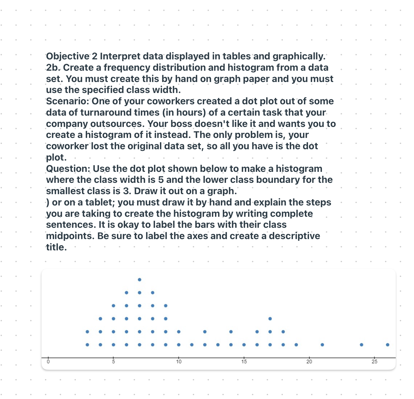
Objective 2 Interpret data displayed in tables and graphically. 2b. Create a frequency distribution and histogram from a data set. You must create this by hand on graph paper and you must use the specified class width. Scenario: One of your coworkers created a dot plot out of some data of turnaround times (in hours) of a certain task that your company outsources. Your boss doesn't like it and wants you to create a histogram of it instead. The only problem is, your coworker lost the original data set, so all you have is the dot plot. Question: Use the dot plot shown below to make a histogram where the class width is 5 and the lower class boundary for the smallest class is 3. Draw it out on a graph. ) or on a tablet; you must draw it by hand and explain the steps you are taking to create the histogram by writing complete sentences. It is okay to label the bars with their class midpoints. Be sure to label the axes and create a descriptive title
Step by Step Solution
There are 3 Steps involved in it

Get step-by-step solutions from verified subject matter experts