

Question: PART TWO 2 - Use the second worksheet titled Toyota Data to complete the follow: Create a heat map ( conditional formatting ) for columns
PART TWO
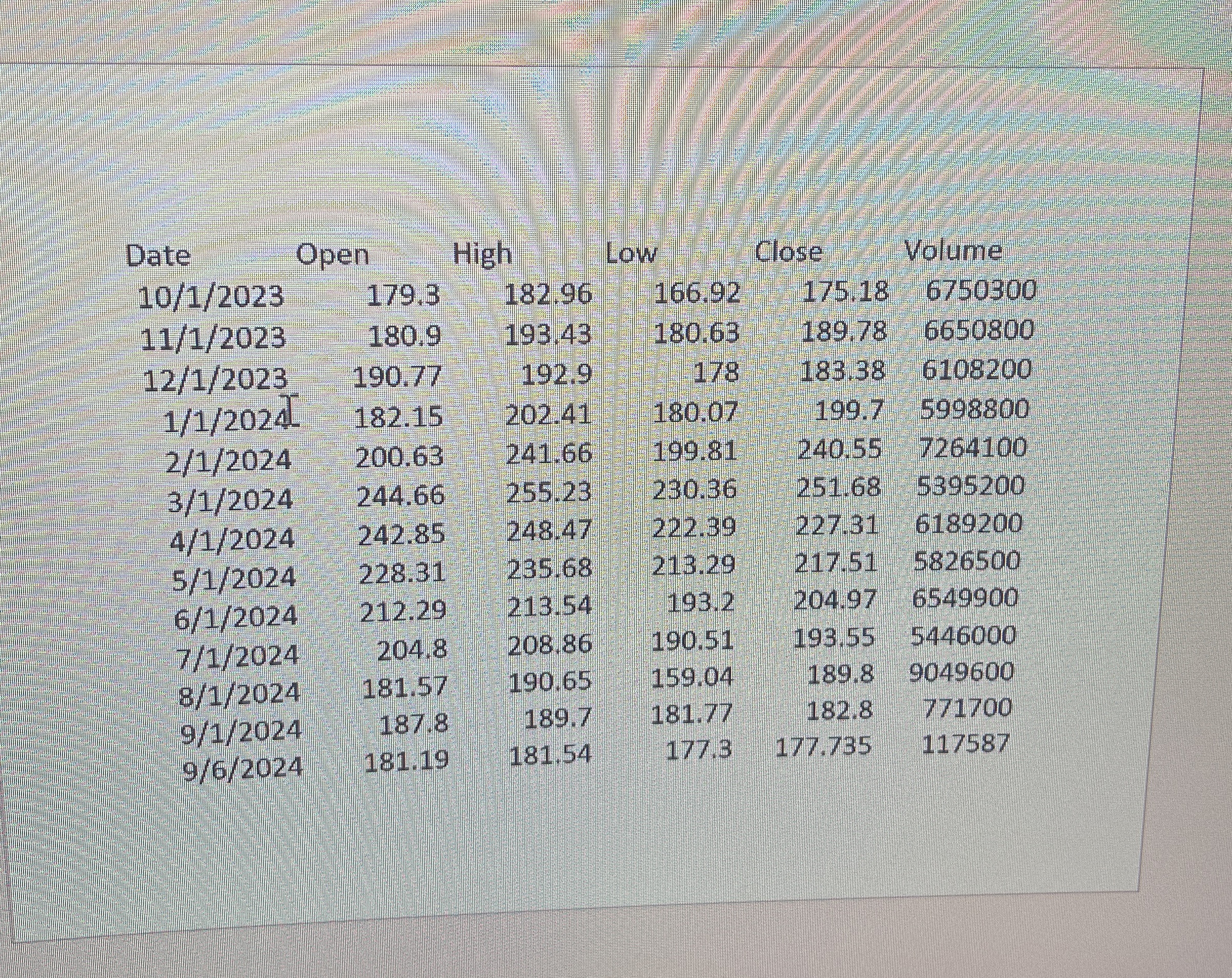
Use the second worksheet titled "Toyota Data" to complete the follow:
Create a heat map conditional formatting for columns Open, High, Low, Close, Adj Close for the year.
Create a line chart for all columns. Volume is the largest of all numbers and its line will stand out. Other lines lay flat along the horizontal axis and
make it impossible to see variations. Use the chart secondary axis for projecting volume. This will transform your chart to show variations of all
numbers.
Copy the previous line chart and paste into the worksheet. Volume should still be on the secondary axis. Use the chart filtering tool to show only
High, Low and Volume. Add trendlines for both High and Low.
Create line sparklines for Open, High, Low, and Close columns. Show green and red points at High and Low of each sparkline respectively. Create
column sparklines for Open, High, Low and Close columns. Show green and red points at High and Low of each sparkline respectively.
Step by Step Solution
There are 3 Steps involved in it
1 Expert Approved Answer
Step: 1 Unlock

Question Has Been Solved by an Expert!
Get step-by-step solutions from verified subject matter experts
Step: 2 Unlock
Step: 3 Unlock