

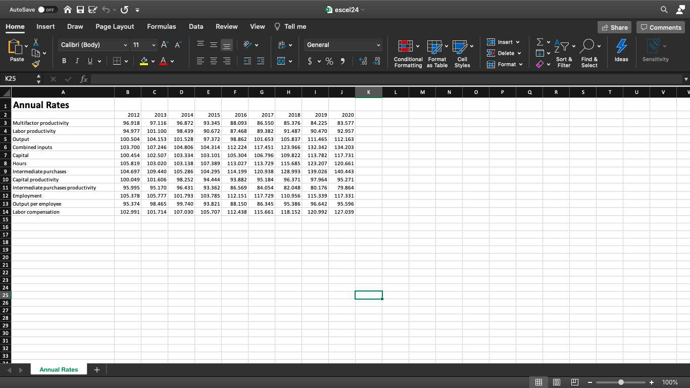
Question: 1- Data in this file show in the picture includes annual rates of productivity, output, capital, and related factors from 2012 to 2020. Create the
1- Data in this file show in the picture includes annual rates of productivity, output, capital, and related factors from 2012 to 2020. Create the following charts using the existing data table. Do not copy partial data in your file. Select and filter data where you need to and create all charts in the same worksheet:
a) A column chart year 2015 data of the following categories:
* Hours
* Employment
* Output per employee
* Labor compensation
b) A line chart for Capital from 2012 to 2020.
c) A pie chart that shows the percentage of each slice for the year 2020 including the following elements:
* Multifactor productivity
* Labor productivity
* Intermediate purchases
* Capital
d) A radar chart for combined inputs from 2012 through 2020.
2- Download Ford Motor Company (F) historical stock market data from Yahoo Finance website. This should be monthly data from the past 12 months.
- Create a heat map including columns Open, High, Low, Close for the year.
- Create a line chart for all columns. Volume is the largest of all numbers and its line will stand out. Other lines lay flat along the horizontal axis and make it impossible to see variations. Use the chart secondary axis for projecting volume. This will transform your chart to show variations of all numbers.
- Use another copy of the line chart. Filter out Open, High, Adj Close, and Close lines from the chart. Leave only Low and Volume. This line chart has trend lines only for Low and Volume.
- Create line sparklines for Open, High, Low, and Close columns. Show green and red points at High and Low of each sparkline respectively. Create column sparklines. Make vertical axis minimum and maximum value options Same for all sparklines.
Step by Step Solution
There are 3 Steps involved in it

Get step-by-step solutions from verified subject matter experts