

Question: Please answer question e, c and f, THANK YOU! t 4. Comparison of means (5 points) a. (1 point) Compare the average test scores (TESTSCR)
Please answer question e, c and f, THANK YOU! t
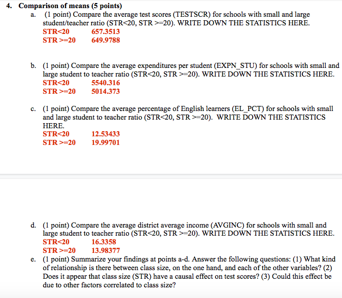
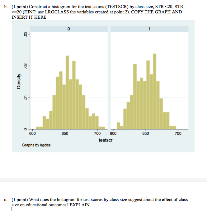
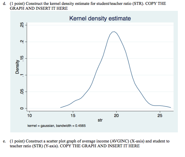
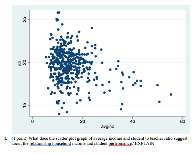
4. Comparison of means (5 points) a. (1 point) Compare the average test scores (TESTSCR) for schools with small and large student/teacher ratio (STR=20). WRITE DOWN THE STATISTICS HERE. STR-20 657.3513 STR >=20 649.9788 b. (1 point) Compare the average expenditures per student (EXPN_STU) for schools with small and large student to teacher ratio (STR=20). WRITE DOWN THE STATISTICS HERE. STR=20 5014.373 c. (1 point) Compare the average percentage of English learners (EL_PCT) for schools with small and large student to teacher ratio (STR 20, STR > 20). WRITE DOWN THE STATISTICS HERE. STR=20 19.99701 d. (1 point) Compare the average district average income (AVGINC) for schools with small and large student to teacher ratio (STR=20). WRITE DOWN THE STATISTICS HERE. STR=20 13.98377 e. (1 point) Summarize your findings at points a-d. Answer the following questions: (1) What kind of relationship is there between class size, on the one hand, and each of the other variables? (2) Does it appear that class size (STR) have a causal effect on test scores? (3) Could this effect be due to other factors correlated to class size?b. (1 point) Construct a histogram for the test scores (TESTSCR) by class size, STR 20 (HINT: use LRGCLASS the variables created at point 2). COPY THE GRAPH AND INSERT IT HERE 0 Density 600 650 700 600 650 700 testscr Graphs by Irgolss C. (1 point) What does the histogram for test scores by class size suggest about the effect of class size on educational outcomes? EXPLAINd. (1 point) Construct the kernel density estimate for student/teacher ratio (STR). COPY THE GRAPH AND INSERT IT HERE Kernel density estimate Density O 10 15 20 25 str kemel = gaussian, bandwidth = 0.4565 e. (1 point) Construct a scatter plot graph of average income (AVGINC) (X-axis) and student to teacher ratio (STR) (Y-axis). COPY THE GRAPH AND INSERT IT HEREstr 20 0 20 40 60 avginc f. (1 point) What does the scatter plot graph of average income and student to teacher ratio suggest about the relationship household income and student perfromance? EXPLAIN
Step by Step Solution
There are 3 Steps involved in it

Get step-by-step solutions from verified subject matter experts