Question: please answer this presentation on Corona and its impact on expatriates to work, this is the Question now I am going to post the laws
please answer this presentation on Corona and its impact on expatriates to work, this is the Question
now I am going to post the laws to be followed for presentation, only give me what should I write in each slide because the layout on me.
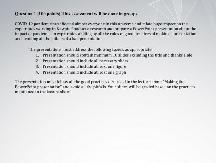
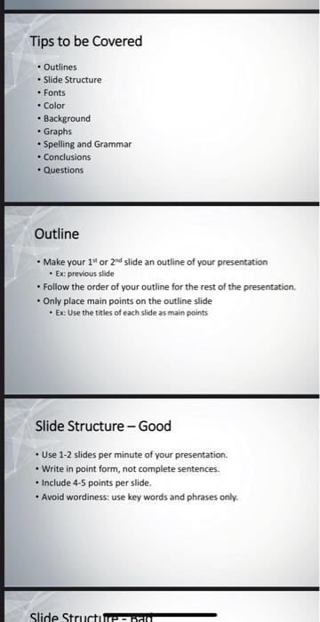
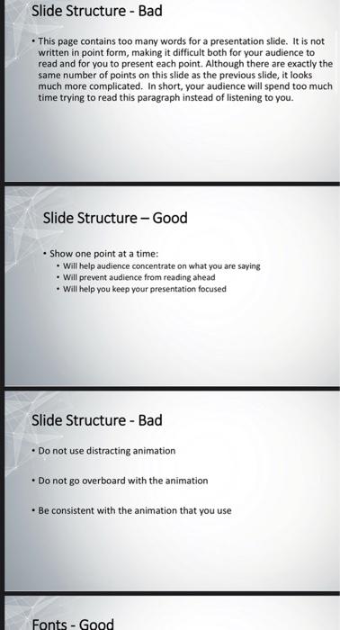
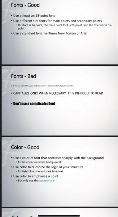
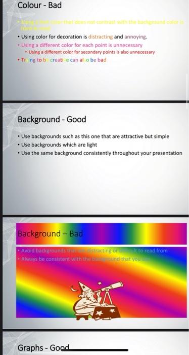
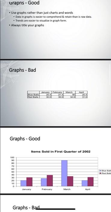
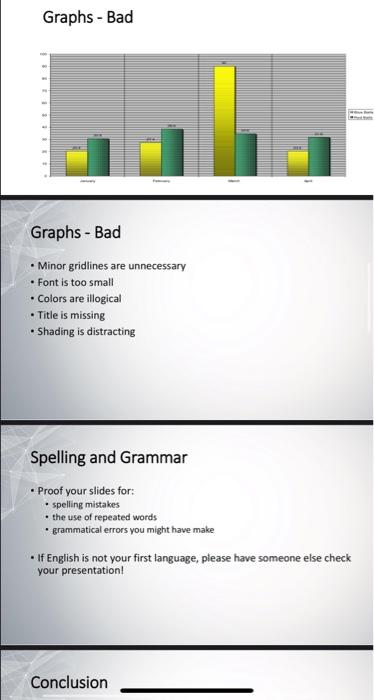
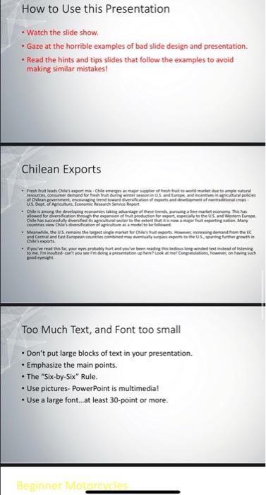
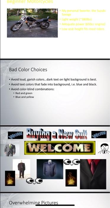
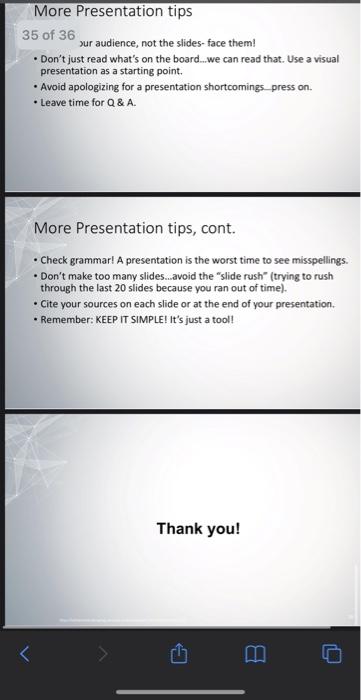
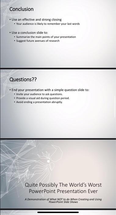
Question 1 (100 points) This assessment will be done in groups COVID-19 pandemic has affected almost everyone in this universe and it had huge impact on the expatriates working in Kuwait. Conduct a research and prepare a PowerPoint presentation about the impact of pandemic on expatriates abiding by all the rules of good practices of making a presentation and avoiding all the pitfalls of a bad presentation. The presentations must address the following issues, as appropriate: 1. Presentation should contain minimum 10 slides excluding the title and thanks slide 2. Presentation should include all necessary slides 3. Presentation should include at least one figure 4. Presentation should include at least one graph The presentation must follow all the good practices discussed in the lecture about "Making the PowerPoint presentation" and avoid all the pitfalls. Your slides will be graded based on the practices mentioned in the lecture slides. Tips to be covered Outlines Slide Structure Fonts - Color Background Graphs Spelling and Grammar . Conclusions Questions Outline Make your 1* or 2nd slide an outline of your presentation Ex previous slide . Follow the order of your outline for the rest of the presentation Only place main points on the outline slide Ex Use the titles of each side as main points Slide Structure - Good Use 1-2 slides per minute of your presentation Write in point form, not complete sentences. Include 4-5 points per slide, . Avoid wordiness: use key words and phrases only. Slide Structura Slide Structure - Bad This page contains too many words for a presentation slide. It is not written in point form, making it difficult both for your audience to read and for you to present each point. Although there are exactly the same number of points on this slide as the previous slide, it looks much more complicated. In short, your audience will spend too much time trying to read this paragraph instead of listening to you. Slide Structure - Good Show one point at a time: . Will help audience concentrate on what you are saying . Will prevent audience from reading ahead . Will help you keep your presentation focused Slide Structure - Bad . Do not use distracting animation . Do not go overboard with the animation Be consistent with the animation that you use Fonts - Good Fonts - Good Use at least an 18-point font Use different size fonts for main points and secondary points this font is 24-point, the main point font is 28-point, and the title font is 36- point Use a standard font like Times New Roman or Arial Fonts - Bad CAPITALIZE ONLY WHEN NECESSARY. IT IS DIFFICULT TO READ Don't use a complicated font Color - Good Use a color of font that contrasts sharply with the background Ex blue font on white background Use color to reinforce the logic of your structure Ex: light blue title and dark blue text Use color to emphasize a point . But only use this occasionally Colour - Bad Using color for decoration is distracting and annoying. Using a different color for each point is unnecessary Using a different color for secondary points is also unnecessary Tiing to b creati e can al o be bad Background - Good Use backgrounds such as this one that are attractive but simple . Use backgrounds which are light Use the same background consistently throughout your presentation Background - Bad Avoid backgrounds tracting to read from Always be consistent with the band that you Graphs - Good Grapns - Good Use graphs rather than just charts and words Data in graphs is easier to comprehend & retain than is raw data. Trends are easier to visualize in graph form. Always title your graphs Graphs - Bad January Feby Blue Bais 204 274 Red Bits 306 March 901 MO Apr 20.4 310 Graphs - Good Items Sold in First Quarter of 2002 100 90 BO 70 60 50 40 30 20 10 O Blue BAR January February March April Graphs - Bad Graphs - Bad Graphs - Bad Minor gridlines are unnecessary Font is too small Colors are illogical Title is missing Shading is distracting Spelling and Grammar Proof your slides for: spelling mistakes . the use of repeated words . grammatical errors you might have make If English is not your first language, please have someone else check your presentation! Conclusion Conclusion Use an effective and strong closing . Your audience is likely to remember your last words Use a conclusion slide to: Summarize the main points of your presentation Suggest future avenues of research Questions?? End your presentation with a simple question slide to: Invite your audience to ask questions. Provide a visual aid during question period. . Avoid ending a presentation abruptly. Quite Possibly The World's Worst PowerPoint Presentation Ever A Demonstration of What NOT to do when Creating and Using PowerPoint Slide Shows How to Use this Presentation Watch the slide show, Gaze at the horrible examples of bad slide design and presentation. Read the hints and tips slides that follow the examples to avoid making similar mistakes! Chilean Exports Fresh fruit leads ClergartChile enam super market to ale natural .consume demand for the during winters and in agricultural police of Chilean government, encouraging trend toward Sverificio aforts and development of retina US Dept. of preconcesa Service Report Chile is among the developing economies taking antage atender market economy. Thisha allowed for diversification through the spansion of fruit production for all to the US and Western Cape Chile has successfully dedos agricultural to the deserting nation. Many countries www diversion of agricultura model to be . Meanwhile, the US remains the largest single market for Chestutegeme, increasing demand from the and Control and Cast European countries combined may eventually upon us, purring further growth in Chile export you read this to your eyes probably hurt and you ve been reading the song winded Best instead of listening sobe. I'm indufted can't you ser doing Congratulations, on having such pode Too Much Text, and Font too small Don't put large blocks of text in your presentation. . Emphasize the main points. The "Six-by-Six" Rule. Use pictures. PowerPoint is multimedia! Use a large font...at least 30-point or more. Beginner More BEZ VODE Bad Color Choices . Avoid loud, garish colors...dark text on light background is best. Avoid text colors that fade into background, i.e. blue and black. . Avoid color-blind combinations: Red and green Blue and yellow ANOW Rying allow Suk WELCOME ANOW Overwhelming Pictures Overwhelming Pictures Use pictures, but don't let them use you. Keep slides SIMPLE! Too much diverts audience away from content Too many pictures also make saving a presentation difficult. 1 or 2 pictures per slide is probably enough. Racquetball Fundamentals 2, 3, or 4 players. 1 player serves, other "returns." Only serving player can score. Served ball must land past serving line and cannot hit back wall. Ball can only bounce once before striking front wal...but ball does not have to bounce Using too much Slide Animation Again, keep slides simple! Apply one Slide Transition style and one Animation Scheme to ALL slides. Don't change between styles- a single style makes a presentation look unified. "Busy" presentations divert audience attention from content. FILE NOT FOUND FILE NOT FOUND Microsoft PowerPoint is unable to open the requested file. This could be because your file is corrupted and/or this is an unsupported file type. Do you wish to retry or cancel? Disk is unformatted. Click "yes" to format your disk now. Boot startup failure, press any key to reboot. Murphy's Law Something will go wrong- test your presentation before you show it. . Always have a backup of your presentation on hand. Be prepared to do the presentation without the PowerPoint...professionals ALWAYS print handouts for the audience. More Presentation tips Talk to your audience, not the slides-face them! Don't just read what's on the board...we can read that. Use a visual presentation as a starting point . Avoid apologizing for a presentation shortcomings.press on. . Leave time for Q&A More Presentation tips, cont. More Presentation tips 35 of 36 sur audience, not the slides-face them! Don't just read what's on the board..we can read that. Use a visual presentation as a starting point . Avoid apologizing for a presentation shortcomings press on. . Leave time for Q&A. More Presentation tips, cont. . Check grammar! A presentation is the worst time to see misspellings Don't make too many slides.avoid the "slide rush" (trying to rush through the last 20 slides because you ran out of time). Cite your sources on each side or at the end of your presentation. Remember: KEEP IT SIMPLE! It's just a tool! Thank you! Conclusion Use an effective and strong closing Your audience is likely to remember your last words Use a conclusion slide to: Summarize the main points of your presentation Suggest future avenues of research Questions?? End your presentation with a simple question slide to: Invite your audience to ask questions. Provide a visual aid during question period. . Avoid ending a presentation abruptly. Quite possibly The World's Worst PowerPoint Presentation Ever A Demonstration of What NOT to do when Creating and Using PowerPoint Slide Shows