

Question: Please code this in R. Thank you so much!! Use: library(tidyverse) library(ggplot2) data(diamonds) Exercises Section 5 1. How does the price distribution of very large
Please code this in R. Thank you so much!!
Use:
library(tidyverse)
library(ggplot2)
data(diamonds)
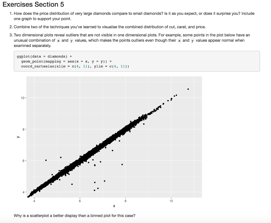
Exercises Section 5 1. How does the price distribution of very large diamonds compare to small diamonds? Is it as you expect, or does it surprise you? Include one graph to support your point. 2. Combine two of the techniques you've learned to visualise the combined distribution of cut, carat, and price. 3. Two dimensional plots reveal outliers that are not visible in one dimensional plots. For example, some points in the plot below have an unusual combination of x and y values, which makes the points outliers even though their x and y values appear normal when examined separately. ggplot (data-diamonds) + geom-point (mapping = aes (x = x, y = y)) + coord_cartesian(xlim c(4, 11, ylim c(4, 11)) 10 - 8- 6- 4 4 6 10 Why is a scatterplot a better display than a binned plot for this case? Exercises Section 5 1. How does the price distribution of very large diamonds compare to small diamonds? Is it as you expect, or does it surprise you? Include one graph to support your point. 2. Combine two of the techniques you've learned to visualise the combined distribution of cut, carat, and price. 3. Two dimensional plots reveal outliers that are not visible in one dimensional plots. For example, some points in the plot below have an unusual combination of x and y values, which makes the points outliers even though their x and y values appear normal when examined separately. ggplot (data-diamonds) + geom-point (mapping = aes (x = x, y = y)) + coord_cartesian(xlim c(4, 11, ylim c(4, 11)) 10 - 8- 6- 4 4 6 10 Why is a scatterplot a better display than a binned plot for this case
Step by Step Solution
There are 3 Steps involved in it

Get step-by-step solutions from verified subject matter experts