Question: Please complete both Closing Case One: Data Visualization: Storytelling with Data and Closing Case Two: Changing the Way You Think About Data, pages 141 -
Please complete both Closing Case One: Data Visualization: Storytelling with Data and Closing Case Two: Changing the Way You Think About Data, pages 141 - 143. 
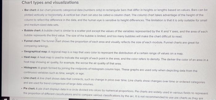
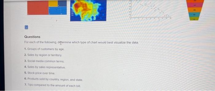
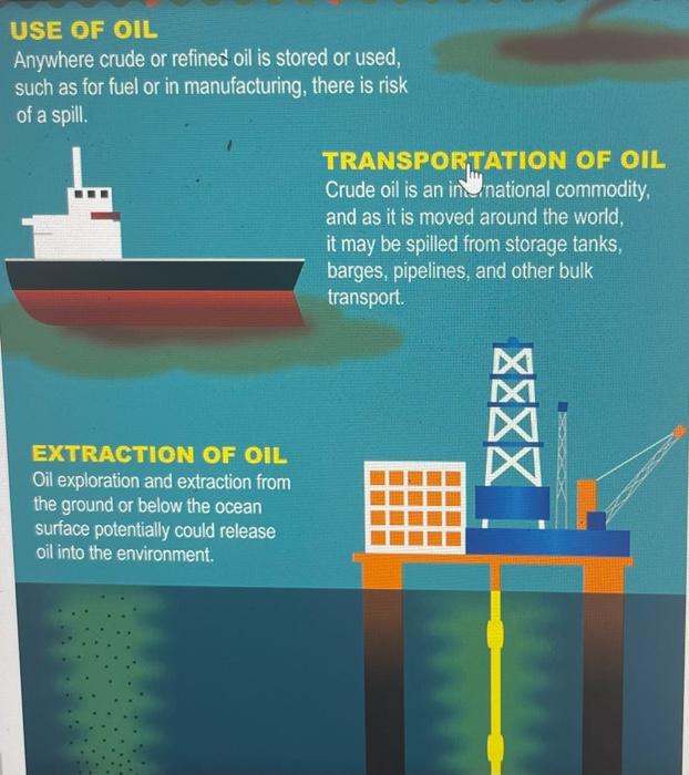
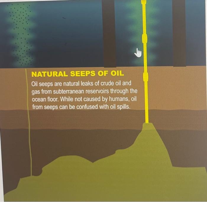
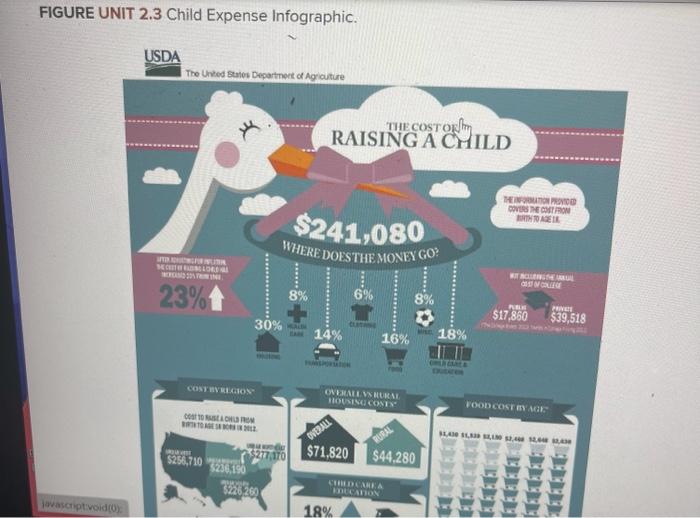
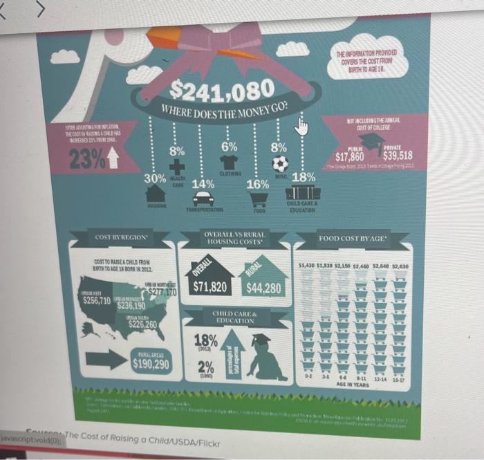
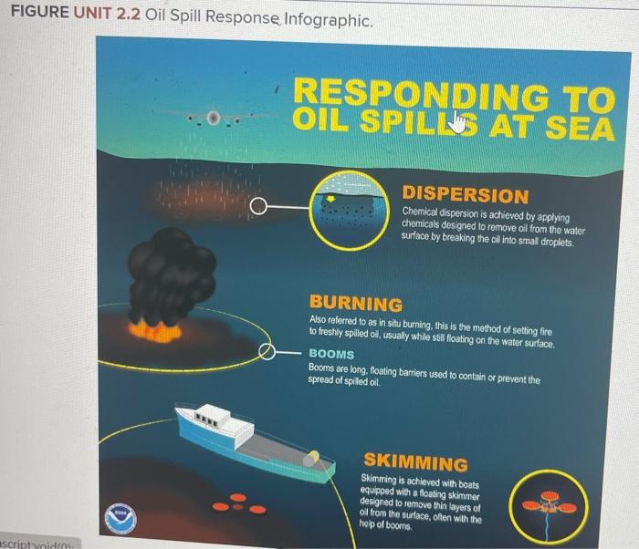
UNIT CLOSING CASE ONE Data Visualization: Storytelling with Data At the intersection of art and algorithm, data visualization schematically abstracts data to bring about a deeper understanding of the dira, wrapping it in an element of awe. While the practice of visually representing data is arguably the foundation of all design, a newound fascination with data visualization has been emerging. After The New York Times and The Guardian recently opened their online archives to the publlc, artists rushed to dissect nearly 2 centuries worth of data, elevating this art form to new prominence. For artists and designers, data visualization is a new frontier of self-expression, powered by the proliferation of data and the evolution of available tools. For enterprise, it is a platform for displaying products and services in the context of the cuitural interaction that surrounds them, retlecting consumers' increasing demand for corporate transparency. Data visualization has nothing to do with pie charts and bar graphs, as they simply offer another view of the data making it easier to understand. Data visualization is actually a different way to view the data and highlights patterns, trends, and correlations. Choosing the right chart type is critical to telling your data story. Here are the top types of charts and the best time to use each. - Bar chart: A bar chart presents categorical data (numbers only) in rectangular bars that differ in heights or lengths based on values. Bars can be platted vertically or norizontaly. A vertical bat chart can also be called a column chart. The column chart takes advantage of the height of the column to reflect the difference in the data, and the human eye is sensitive to height differences. The limitation is that it is only suitable for smail and medium-sized doto sets. - Bubble chart: A bubble chart is simiar to a scatter pot except the values of the variables represented by the X and Y axes, and the area of each bubble represents the third value. The size of the bubble is limited, and too many bubbles will make the chast difficult to read. - Funnel chart The funnel chart shows the proportion of each areo and visually reflects the size of each modute. Funnel chorts are great for comoanng rarkings: - Geographleal map: A regional mop is a map that uses coloc to represent the distribution of a certain rango of values on a map. - Heat map: A heat map is used to indicote the weight of each point in the area, and the color refers to density. The darker the color of an area in a hed map showing air quality, for example, the worse the air quality of that area. - Histogram: A groph formed by joining the midpoints of histogram coumn tops. These graphs are used only when depicting dota from the continuous variabies such as time, weight, or age. - Line chert: A line chart shows data that connects, such as change in price over time, Line chants show changes over time or-ordered categories ond are used for trend comparison of large date volumes. - Plo chart: A pie chart displays dato in a circle divided into slices by riumerical proportions, Pie charts are widely used in various fields to reprerent the propontion of different classifications and 10 compare various classifications by the orci it is not recommended to use pie charts as they are - Scatter plot: A scotler plot displays the correlation between two variables. The position of the point is determined by the value of the variable. It is important to use a great deal of dota when creating a scatter plot otherwise, it is difficuit to find the correlations. - Treemagn: Treemops present dota in hicrarchical relationships, making it easy to spot patterns, such as which items are a stores best seliers. The tree branchies dre represented by rectangies, and each sub-branch is shown as a smatier rectangle. - Word cloud chart: A word cloud is the simplest form of text visualization and is a visual representation of toxt data. A word clowd is used to dispisy a fntge amsunt of text date and can quickly help hightight the most frecuently used text. Words are arranged in different sizes, colors, and positions based on frequency. categorizetion, or significance. Font size varies based on word frequency. Questions For each of the following, deftermine which type of chort would best visualize the dota. 1. Groups of customers by soe. 2. Sales by region or territory. 3. Social med a common terms, 4. Silles by soles representative: 5. Stock price over time. 6. Products sold by country, region, and state. 7. Tips compared to the amount of each ball. Changing the Way You Think about Data Since the beginning of time, humans have been using pictures and images to communicate, moving from cave drawings to hieroglyphics to the Internet. Today, it is easier than ever to paint a picture worth 100,000 words, thanks to technological advances. The primary advantages are databases and data warehouses that capture enormous amounts of data. Informing means accessing large amounts of data from different management information systems. Any article or advertisement that uses visual images can significantly improve the number of views a message generates. This can be a true competitive advantage in the digital age. Good data alone does not make a good data story. Data storytelling is only effective when it provides value, whether it teaches people something new, gives them a new perspective, or inspires them to take action. Data visualization can help reveal trends. patterns, and exceptions. It can empower businesses to make more informed, longer-term decisions as well as communicate with customers and prospects more effectively. The way you deliver that story cletermines whether that message is communicated. Your narrative should guide readers through, provide context, and help them synthesize the data story as effectively as possible. Questions message is communicated. Your narrative should guide readers through, provide context, and help them synthesize the data story as effectively as possible. Questions Remember that your data story must provide visual representation of any data that can help make the data more interesting. In a group, review the two examples below ( $ Figures Unit 2.1, [2.2, and $2.3 ) and determine the following: 1. Does the visuoizotion tell the whole slory? Are there any questons you cannot answerjust by reviewing the visualization? 2. Are there any dats elements thot should be removed or added to the visualization to make it more interesting? 2. Ronk the visuavention in ofder of best data story i7 to worst data story (3). Whot criteria did you use to rank the visualizations? 4. Find an example of a datostory on the insernet and share it with your peers. Be sure to highight the pros and cons of the date story. FIGURE UNIT 2.1 Oil Snill Inforranhir Anywhere crude or refined oil is stored or used, such as for fuel or in manufacturing, there is risk of a spill. EXTRACTION OF OIL Oil exploration and extraction from the ground or below the ocean surface potentially could release oil into the environment. NATURAL SEEPS OF OHL Oil seeps are natural leaks of crude oil and gas from subterranean reservoirs through the ocean floor. While not caused by humans, oil from seeps can be confused with oil spills. FIGURE UNIT 2.3 Child Expense Infographic. FIGURE UNIT n n n:i c..:n n UNIT CLOSING CASE ONE Data Visualization: Storytelling with Data At the intersection of art and algorithm, data visualization schematically abstracts data to bring about a deeper understanding of the dira, wrapping it in an element of awe. While the practice of visually representing data is arguably the foundation of all design, a newound fascination with data visualization has been emerging. After The New York Times and The Guardian recently opened their online archives to the publlc, artists rushed to dissect nearly 2 centuries worth of data, elevating this art form to new prominence. For artists and designers, data visualization is a new frontier of self-expression, powered by the proliferation of data and the evolution of available tools. For enterprise, it is a platform for displaying products and services in the context of the cuitural interaction that surrounds them, retlecting consumers' increasing demand for corporate transparency. Data visualization has nothing to do with pie charts and bar graphs, as they simply offer another view of the data making it easier to understand. Data visualization is actually a different way to view the data and highlights patterns, trends, and correlations. Choosing the right chart type is critical to telling your data story. Here are the top types of charts and the best time to use each. - Bar chart: A bar chart presents categorical data (numbers only) in rectangular bars that differ in heights or lengths based on values. Bars can be platted vertically or norizontaly. A vertical bat chart can also be called a column chart. The column chart takes advantage of the height of the column to reflect the difference in the data, and the human eye is sensitive to height differences. The limitation is that it is only suitable for smail and medium-sized doto sets. - Bubble chart: A bubble chart is simiar to a scatter pot except the values of the variables represented by the X and Y axes, and the area of each bubble represents the third value. The size of the bubble is limited, and too many bubbles will make the chast difficult to read. - Funnel chart The funnel chart shows the proportion of each areo and visually reflects the size of each modute. Funnel chorts are great for comoanng rarkings: - Geographleal map: A regional mop is a map that uses coloc to represent the distribution of a certain rango of values on a map. - Heat map: A heat map is used to indicote the weight of each point in the area, and the color refers to density. The darker the color of an area in a hed map showing air quality, for example, the worse the air quality of that area. - Histogram: A groph formed by joining the midpoints of histogram coumn tops. These graphs are used only when depicting dota from the continuous variabies such as time, weight, or age. - Line chert: A line chart shows data that connects, such as change in price over time, Line chants show changes over time or-ordered categories ond are used for trend comparison of large date volumes. - Plo chart: A pie chart displays dato in a circle divided into slices by riumerical proportions, Pie charts are widely used in various fields to reprerent the propontion of different classifications and 10 compare various classifications by the orci it is not recommended to use pie charts as they are - Scatter plot: A scotler plot displays the correlation between two variables. The position of the point is determined by the value of the variable. It is important to use a great deal of dota when creating a scatter plot otherwise, it is difficuit to find the correlations. - Treemagn: Treemops present dota in hicrarchical relationships, making it easy to spot patterns, such as which items are a stores best seliers. The tree branchies dre represented by rectangies, and each sub-branch is shown as a smatier rectangle. - Word cloud chart: A word cloud is the simplest form of text visualization and is a visual representation of toxt data. A word clowd is used to dispisy a fntge amsunt of text date and can quickly help hightight the most frecuently used text. Words are arranged in different sizes, colors, and positions based on frequency. categorizetion, or significance. Font size varies based on word frequency. Questions For each of the following, deftermine which type of chort would best visualize the dota. 1. Groups of customers by soe. 2. Sales by region or territory. 3. Social med a common terms, 4. Silles by soles representative: 5. Stock price over time. 6. Products sold by country, region, and state. 7. Tips compared to the amount of each ball. Changing the Way You Think about Data Since the beginning of time, humans have been using pictures and images to communicate, moving from cave drawings to hieroglyphics to the Internet. Today, it is easier than ever to paint a picture worth 100,000 words, thanks to technological advances. The primary advantages are databases and data warehouses that capture enormous amounts of data. Informing means accessing large amounts of data from different management information systems. Any article or advertisement that uses visual images can significantly improve the number of views a message generates. This can be a true competitive advantage in the digital age. Good data alone does not make a good data story. Data storytelling is only effective when it provides value, whether it teaches people something new, gives them a new perspective, or inspires them to take action. Data visualization can help reveal trends. patterns, and exceptions. It can empower businesses to make more informed, longer-term decisions as well as communicate with customers and prospects more effectively. The way you deliver that story cletermines whether that message is communicated. Your narrative should guide readers through, provide context, and help them synthesize the data story as effectively as possible. Questions message is communicated. Your narrative should guide readers through, provide context, and help them synthesize the data story as effectively as possible. Questions Remember that your data story must provide visual representation of any data that can help make the data more interesting. In a group, review the two examples below ( $ Figures Unit 2.1, [2.2, and $2.3 ) and determine the following: 1. Does the visuoizotion tell the whole slory? Are there any questons you cannot answerjust by reviewing the visualization? 2. Are there any dats elements thot should be removed or added to the visualization to make it more interesting? 2. Ronk the visuavention in ofder of best data story i7 to worst data story (3). Whot criteria did you use to rank the visualizations? 4. Find an example of a datostory on the insernet and share it with your peers. Be sure to highight the pros and cons of the date story. FIGURE UNIT 2.1 Oil Snill Inforranhir Anywhere crude or refined oil is stored or used, such as for fuel or in manufacturing, there is risk of a spill. EXTRACTION OF OIL Oil exploration and extraction from the ground or below the ocean surface potentially could release oil into the environment. NATURAL SEEPS OF OHL Oil seeps are natural leaks of crude oil and gas from subterranean reservoirs through the ocean floor. While not caused by humans, oil from seeps can be confused with oil spills. FIGURE UNIT 2.3 Child Expense Infographic. FIGURE UNIT n n n:i c..:n n