Question: please help 2.1f the workbok opens in Protected View, click the Enable Editing button in the Message Ear at the top of the workbook so


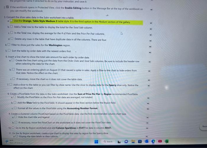
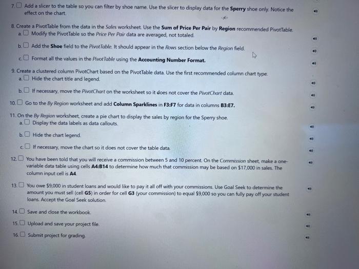
2.1f the workbok opens in Protected View, click the Enable Editing button in the Message Ear at the top of the workbook so you can modify the workbook 3. Convert the shoe sales data in the Sales worksheet into a table. a Use the Orange, Table Style Medium 3 table style it is the thind option in the Meduurn section of the gallery. b Add a Total row to the table to display the total for the Total Sale column. In the Total row, display the average for the e of Poirs and the Price Per Powr columns. Delete any rows in the table that have duplicate data in all the columns There are four: 4 Filter to show just the sales tor the Washington region. 5. Sort the table by order date with the newest orders first. 6. Insert a line chart to show the total sale amount for each order by order date. a Create the line chart using just the data from the Order Dote and Iotal Sale columns, Be sure to include the heider row when selecting the data for the chart b. There was an ordering 9 ittch on August 31 that caused a spike in sales. Apply a filter to the chart to hide orden from that date. Notice the effect on the chart. If necessary, move the chart so it does not cover the table data. 7. Add a slicer to the table so you can filter by shoe name. Use the slicer to daplay data for the Sperry shoe only : Notice the effect on the chart. 8. Create a PivotTsble from the data in the Sales workheet Use the Sum of Price Per Pair by Region recommended PhotTable. a Modify the PivotTable so the Price Aos fair data are averaged, not totaled b Add the Shoe field to the Pivatiable it should appear in the Aows section below the Region field. Format all the values in the Pivorfable using the Accounting Number Format. 9. Create a dustered columin FivotChiut bosed on the PivotTable data. Use the first recommended columin chart type. Hide the chart vitle and legend. b. If necessary, mave the PiveChort on the workheet so it does nos cover the Pivatchat data 10 So to the by Reyion worksheet and add Column Sparklines in F3:F7 for data in columns a3:E7. 7 Add a slicer to the table so you can filter by shoe name. Use the slicer to display data for the Sperry shoe only. Notice the effect on the chart. 8. Create a PivotTable from the data in the Soles worksheet. Use the Sum of Price Per Pair by Region recommended Pivot Table. a. Modify the PivotTable so the Price Per Poir data are averaged, not totaled. b. Add the Shoe field to the PivotTable. It should appear in the Rows section below the Region field. Format all the values in the Pivotloble using the Accounting Number Format. 9. Create a clustered column PivotChart based on the PivotTable data. Use the first recommended column chart type. a. Hide the chart title and legend, b If necessary, move the PivorChart on the worksheet so it does not cover the PivotChart data. 10. Go to the By Region worksheet and add Column Sparklines in F3:F7 for data in columns B3:E7. 11. On the By Region worksheet, create a pie chart to display the sales by region for the Sperry shoe. a Display the data labels as data callouts. b. Hide the chart legend. c. If necessary, move the chart so it does not cover the table data. 12 You have been told that you will receive a commission between 5 and 10 percent. On the Commission sheet, make a onevariable data table using cells A4:B14 to determine how much that commission may be based on $17,000 in sales. The column input cell is A4
Step by Step Solution
There are 3 Steps involved in it

Get step-by-step solutions from verified subject matter experts


