

Question: please help. Is the answer for the second part a or b? An article reported the national market share of leading sellers of carbonated soft
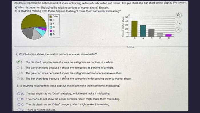
An article reported the national market share of leading sellers of carbonated soft drinks. The pie chart and bar chart below display the values. a) Which is better for displaying the relative portions of market share? Explain. b) is anything missing from these displays that might make them somewhat misleading? a) Which display shows the relative portions of market share better? A. The pie chart does because it shows the categories as portions of a whole. B. The bar chart does because it shows the categories as portions of a whole. C. The pie chart does because it shows the categories without spaces between them. D. The bar chart does because it shiws the categories in descending order by market share. b) Is anything missing from these displays that might make them somewhat misleading? A. The bar chart has no "Other' catogory, which might make at misleading. B. The charts do not show the actual percents, which might make them misieading. C. The pie chart has an "Other' category, which might make 4 misleading. D. There is nothing missing
Step by Step Solution
There are 3 Steps involved in it

Get step-by-step solutions from verified subject matter experts