

Question: Please Help! please include charts, I don't need explanation on how to make the charts just summary of the ways that data are used and
Please Help! please include charts, I don't need explanation on how to make the charts just summary of the ways that data are used and presented.
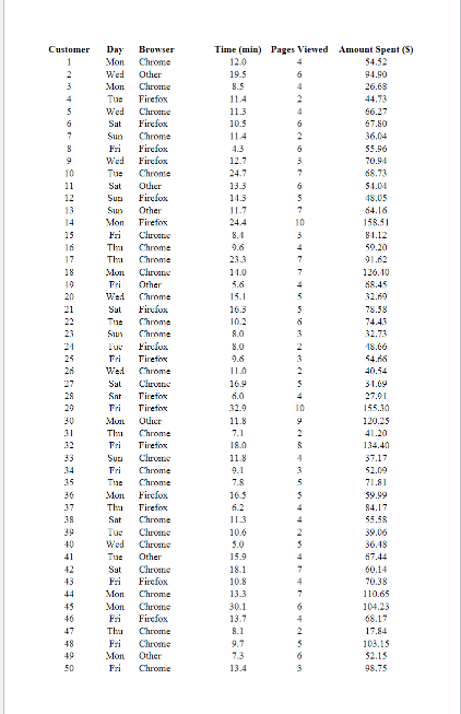
Use descriptive statistics and other graphical and numerical summaries (Excel data analysis output tables, pivot tables/charts, scatter plots, etc.) to learn about the customers who visit the Lake Champlain Chocolate website. The result for submission into Canvas is a written analysis and interpretation of the required elements in your report with graphical and numerical summaries as part of the report.
Descriptive statistics for the time spent on the website, the number of pages viewed, and the amount spent on the websitethe mean amount spent per transaction. Discuss what you learn about Lake Champlain Chocolates online shoppers from these graphical and numerical summaries. Hint: Histograms are an excellent visual summary of the information inserted with the normal distribution curve.
Summarize the frequency, the total dollars spent, and the mean amount spent per transaction for each day of the week. What observations can you make about Lake Champlain Chocolates business based on the day of the week? Then, analyze and interpret your analysis results for this question.
Summarize the frequency, the total dollars spent, and the mean amount spent per transaction for each browser type. What observations can you make about Lake Champlain Chocolates business based on the browser type? Discuss. Analyze and interpret your analysis results.
Develop a scatter diagram and compute the sample correlation coefficient to explore the relationship between the time spent on the website and the dollar amount spent. Use the horizontal axis for the time spent on the website. Discuss. Analyze and interpret your analysis results.
Develop a scatter diagram and compute the sample correlation coefficient to explore the relationship between the number of website pages viewed and the amount spent. Use the horizontal axis for the number of website pages viewed. Discuss. Analyze and interpret your analysis results.
Develop a scatter diagram and compute the sample correlation coefficient to explore the relationship between the time spent on the website and the number of pages viewed. Use the horizontal axis to represent the number of pages viewed. Discuss. Analyze and interpret your analysis results.
Step by Step Solution
There are 3 Steps involved in it

Get step-by-step solutions from verified subject matter experts