

Question: please help. The following visualization was prepared for a management dashboard to monitor profit margin. How might this visualization be misleading? The data has been
please help. 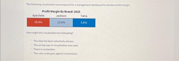
The following visualization was prepared for a management dashboard to monitor profit margin. How might this visualization be misleading? The data has been selectively chosen. The wrong type of visualization was used. There is no baseline. The color scale goes against comventions
Step by Step Solution
There are 3 Steps involved in it
1 Expert Approved Answer
Step: 1 Unlock

Question Has Been Solved by an Expert!
Get step-by-step solutions from verified subject matter experts
Step: 2 Unlock
Step: 3 Unlock