

Question: Please help with part 3! To draw in the high-low line, choose the insert, then shapes, then click on the straight line from the list
Please help with part 3!
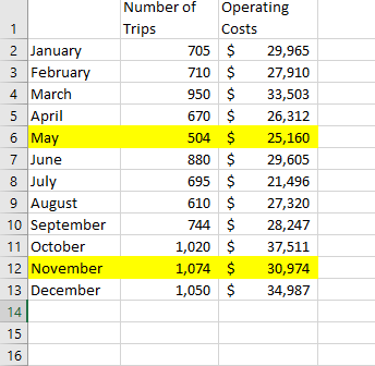
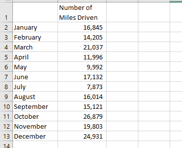
To draw in the high-low line, choose the "insert", then "shapes", then click on the straight line from the list of possble shapes. Put your cursor on the highest-volume data point and "drag" the line through the lowest-volume data point, all the way back to the y-axis. Now check: does the fixed cost in your high-low equation agree with the line you just drew? It should. Label the high-lowline as well as the trend line (AKA regression line) Add a descriptive title to the scatter plot on the page and appropriate labels for each axis. That is, make it look like something you would present to a client! Use "insert "textbox" to comment on which line looks like it better represents the data points. Explain why the two lines are different Use "insert" "textbox" to address the following: Predict ABC's operating costs for a month in which 1,000 trips are made. This time, use 1) the regression equation. Compare the result to the prediction you made using the high- low method 2) Interpret the R square figure. iIn general, what does the R-square statistic tell management? ii. What is the R-square value from this regression? iii. What does it tell you about this particular set of data and your confidence in using the resulting equation for making predictions? Rename the sheet by right-clicking on the "Chart 1" tab at the bottom of the screen and choosing "rename". Give the sheet an appropriate name Part 3: Create Scatter plot, regression line, and high-low line using Number of miles driven as the cost driver Click on the "Miles Driven" tab at the bottom of the screen. Copy and paste the monthly operating costs into this sheet so that you can perform a similar analysis based on a different cost driver (miles driven). That is, show the high-low line but do not develop the cost equation. Nete Dea'tdethe high low method fer thie data set Create a new scatter plot, using "number of miles driven" as the cost driver. Put it on a new sheet, just like before, and then give the sheet an appropriate name. Give the scatter plot a title, label both axes, comment on possible outliers (or comment that none appear to exist) add the regression line and high-low line, label the lines, and add the regression equation and R-square, using the same steps described above.. Somewhere on the graph, answer the following question using the insert textbox command: If you were ABC's management, would you use 1) number of trips made, or 2) number of miles driven as the best cost driver for making future cost estimates. WHY?? What helped you reach your decision? Number of Operating 1 Trips Costs 2 January 3 February 705 $ 29,965 710 $ 27,910 950 $ 4 March 33,503 5 April 6 May 7 June 8 July 9 August 670 $ 26,312 504 $ 25,160 880$ 29,605 695$ 21,496 610 $ 27,320 744 $ 10 September 28,247 1,020 $ 1,074 $ 11 October 37,511 12 November 13 December 30,974 1,050 $ 34,987 14 15 16 Number of Miles Driven 1 2 January 3 February 16,845 14,205 4 March 21,037 5 April 6 May 7 June 11,996 9,992 17,132 8 July 9 August |September 11 October 12 November 13 December 7,873 16,014 15,121 26,879 19,803 24,931 14 To draw in the high-low line, choose the "insert", then "shapes", then click on the straight line from the list of possble shapes. Put your cursor on the highest-volume data point and "drag" the line through the lowest-volume data point, all the way back to the y-axis. Now check: does the fixed cost in your high-low equation agree with the line you just drew? It should. Label the high-lowline as well as the trend line (AKA regression line) Add a descriptive title to the scatter plot on the page and appropriate labels for each axis. That is, make it look like something you would present to a client! Use "insert "textbox" to comment on which line looks like it better represents the data points. Explain why the two lines are different Use "insert" "textbox" to address the following: Predict ABC's operating costs for a month in which 1,000 trips are made. This time, use 1) the regression equation. Compare the result to the prediction you made using the high- low method 2) Interpret the R square figure. iIn general, what does the R-square statistic tell management? ii. What is the R-square value from this regression? iii. What does it tell you about this particular set of data and your confidence in using the resulting equation for making predictions? Rename the sheet by right-clicking on the "Chart 1" tab at the bottom of the screen and choosing "rename". Give the sheet an appropriate name Part 3: Create Scatter plot, regression line, and high-low line using Number of miles driven as the cost driver Click on the "Miles Driven" tab at the bottom of the screen. Copy and paste the monthly operating costs into this sheet so that you can perform a similar analysis based on a different cost driver (miles driven). That is, show the high-low line but do not develop the cost equation. Nete Dea'tdethe high low method fer thie data set Create a new scatter plot, using "number of miles driven" as the cost driver. Put it on a new sheet, just like before, and then give the sheet an appropriate name. Give the scatter plot a title, label both axes, comment on possible outliers (or comment that none appear to exist) add the regression line and high-low line, label the lines, and add the regression equation and R-square, using the same steps described above.. Somewhere on the graph, answer the following question using the insert textbox command: If you were ABC's management, would you use 1) number of trips made, or 2) number of miles driven as the best cost driver for making future cost estimates. WHY?? What helped you reach your decision? Number of Operating 1 Trips Costs 2 January 3 February 705 $ 29,965 710 $ 27,910 950 $ 4 March 33,503 5 April 6 May 7 June 8 July 9 August 670 $ 26,312 504 $ 25,160 880$ 29,605 695$ 21,496 610 $ 27,320 744 $ 10 September 28,247 1,020 $ 1,074 $ 11 October 37,511 12 November 13 December 30,974 1,050 $ 34,987 14 15 16 Number of Miles Driven 1 2 January 3 February 16,845 14,205 4 March 21,037 5 April 6 May 7 June 11,996 9,992 17,132 8 July 9 August |September 11 October 12 November 13 December 7,873 16,014 15,121 26,879 19,803 24,931 14
Step by Step Solution
There are 3 Steps involved in it

Get step-by-step solutions from verified subject matter experts